How We Gave a Weight Loss Brand Newfound Confidence
Ireland’s largest weight loss brand has been around for over 50 years. They’ve perfected an approach to weight loss that’s all about creating a healthy relationship with food, a positive attitude toward exercise and an impact on mental health. The deep relationships they’ve formed with their members are proof of the strength and joy of the program. However, Unisim’s visual identity wasn’t giving off the same energy.
Our objective: Refresh Unislim’s visual identity to better reflect body positivity and communicate the joyful experience of the program.
Unislim is on a mission to help people live healthier lifestyles and feel more confident and happy in their own bodies.
Our Key Insight
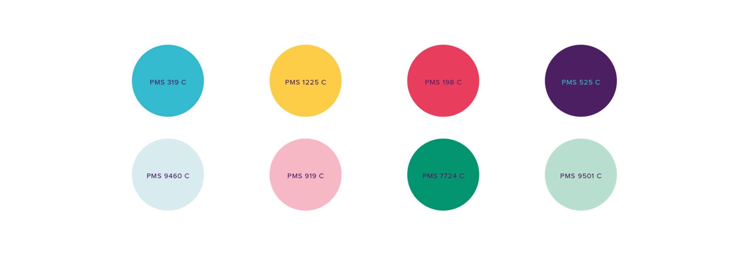
Organic shapes and energetic colors will help convey the powerful, personal human touch of the program.
The Uncommon Solution
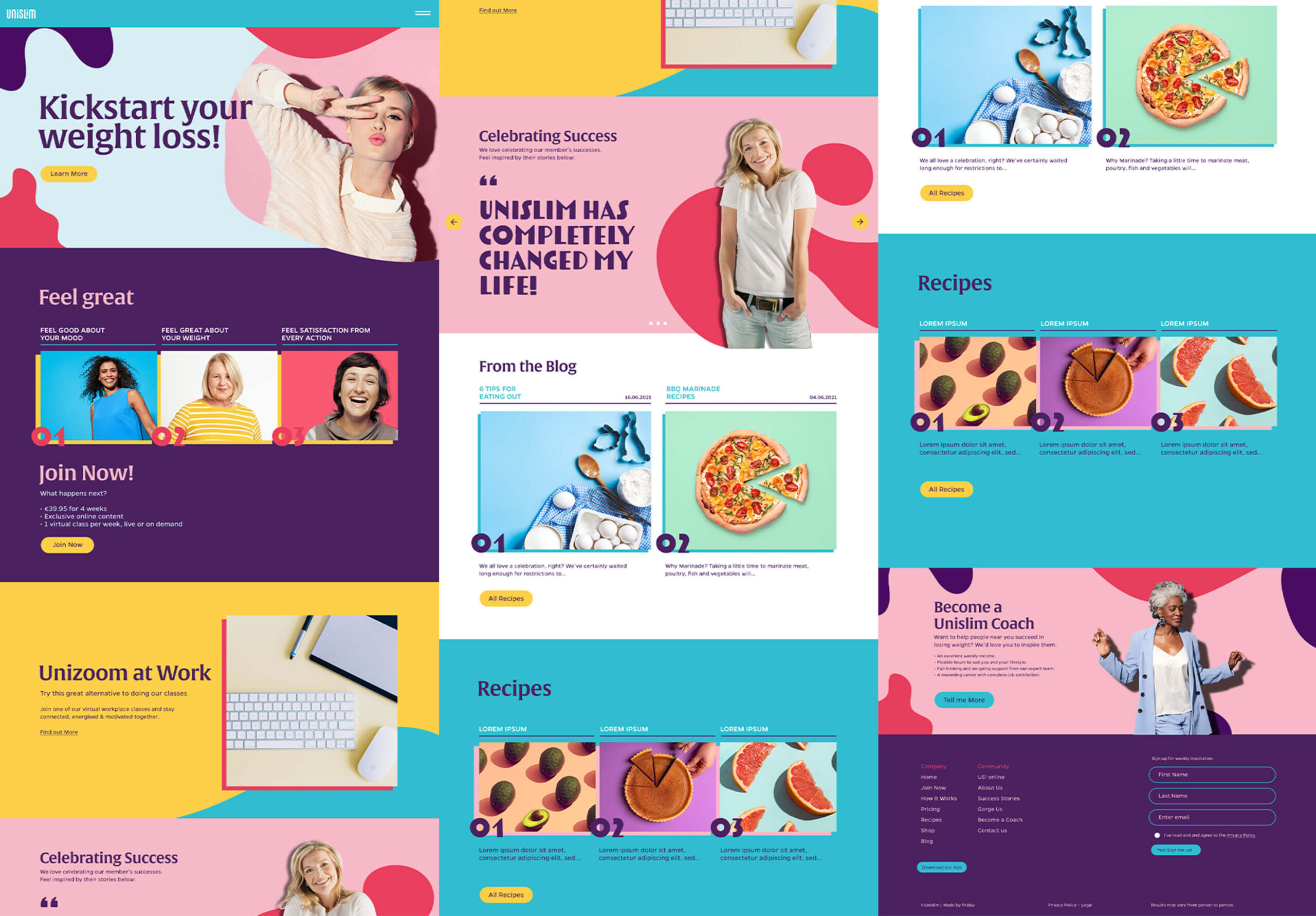
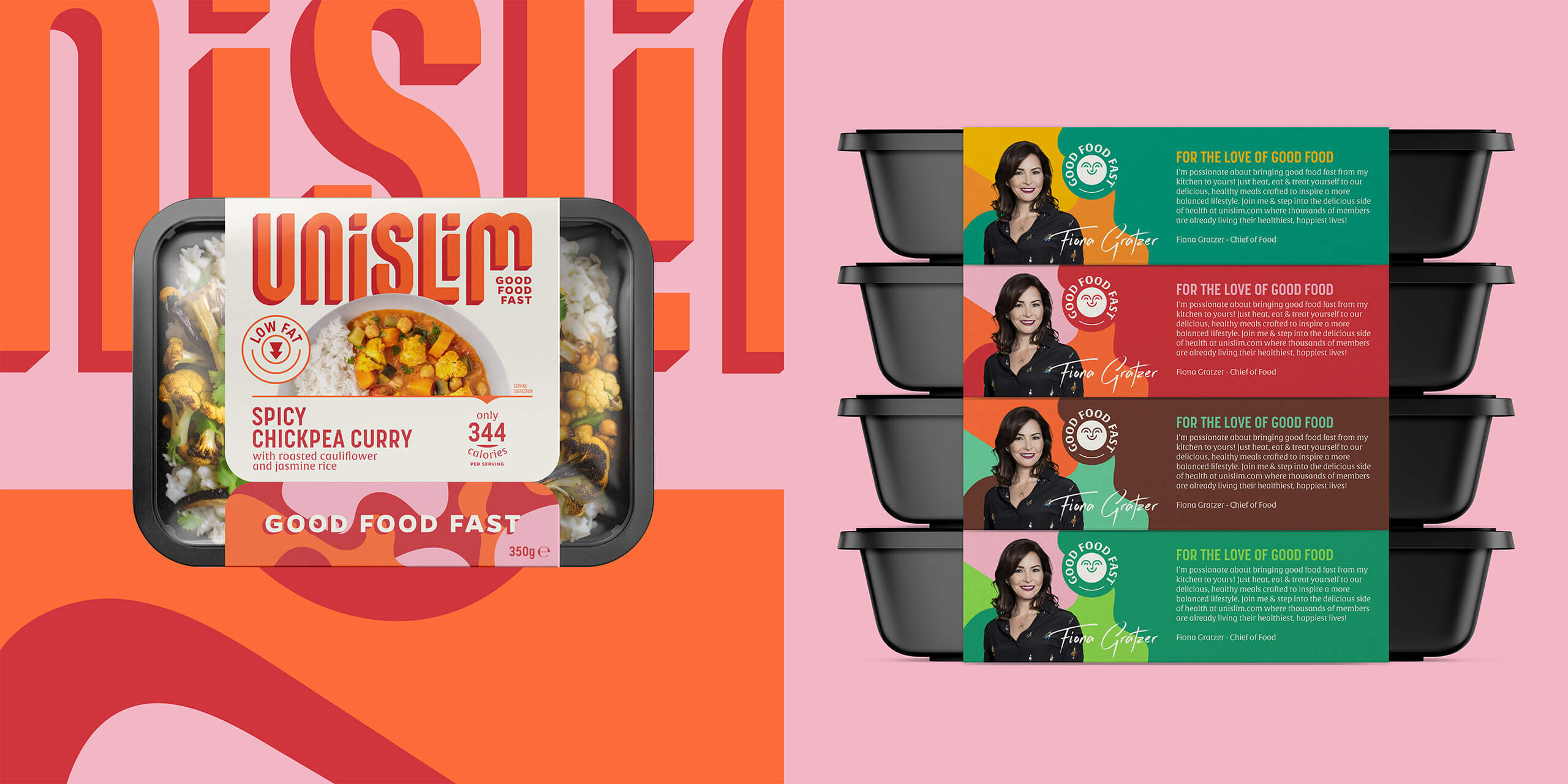
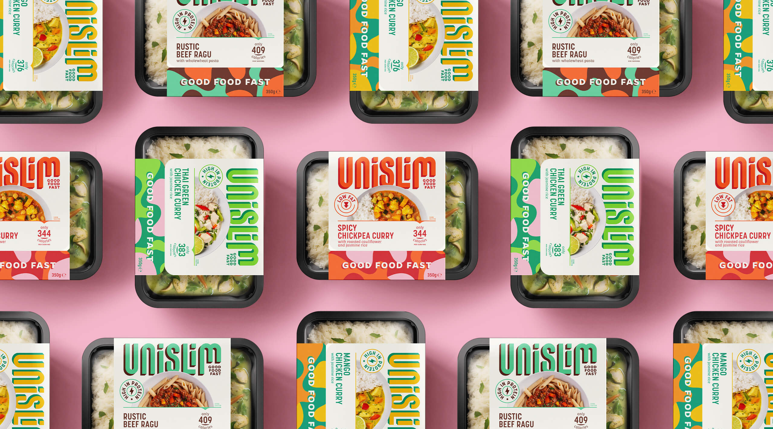
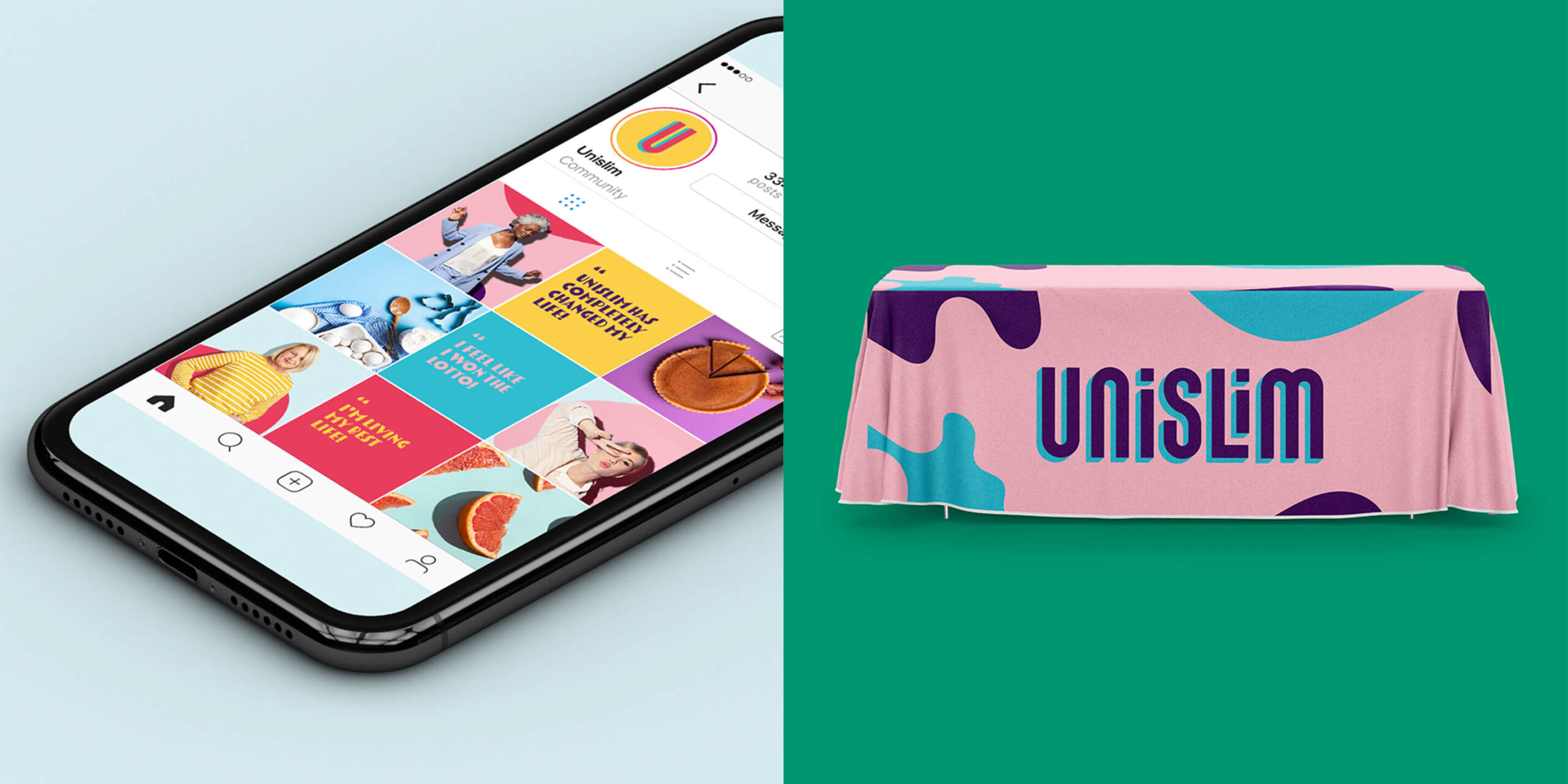
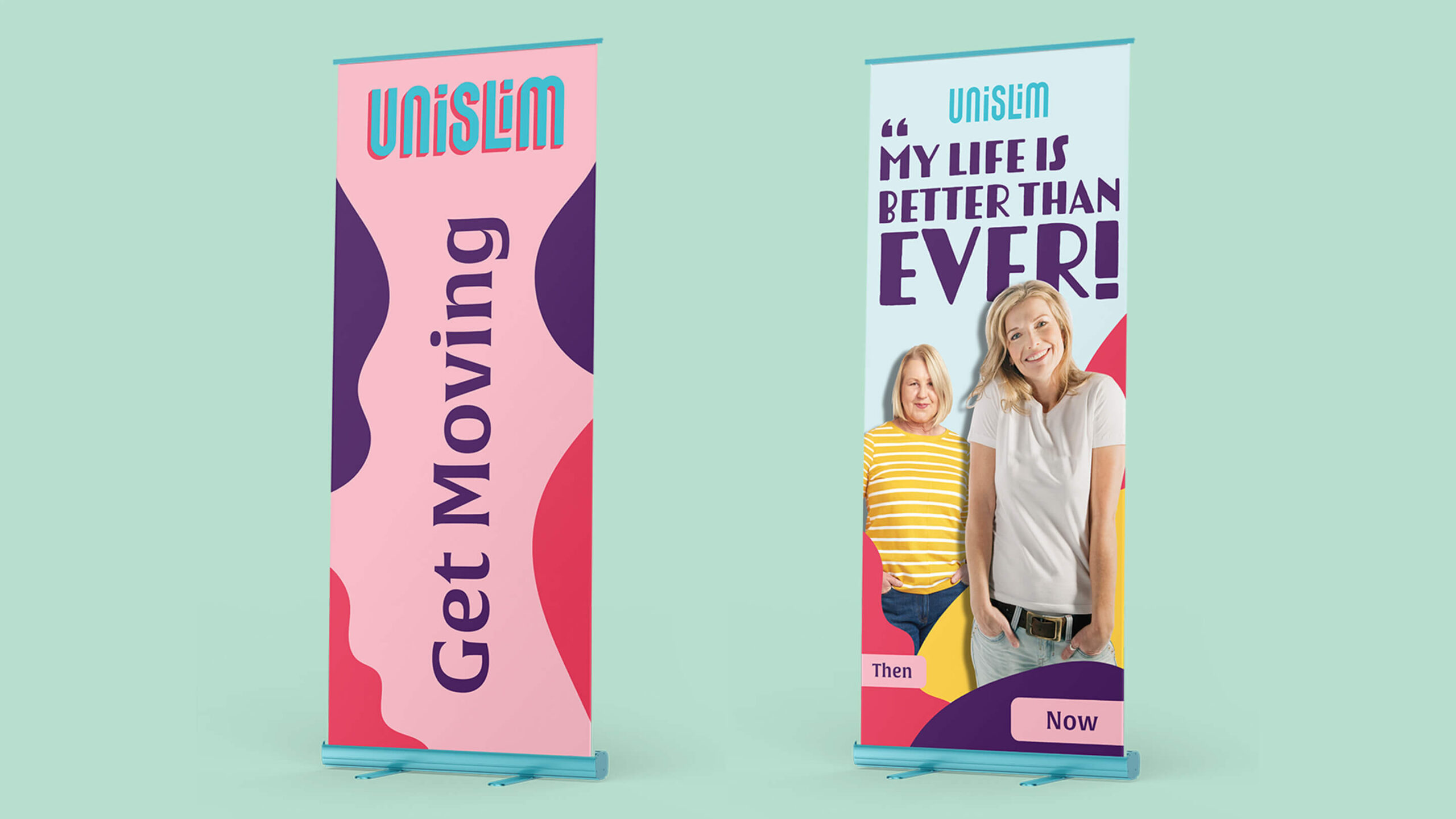
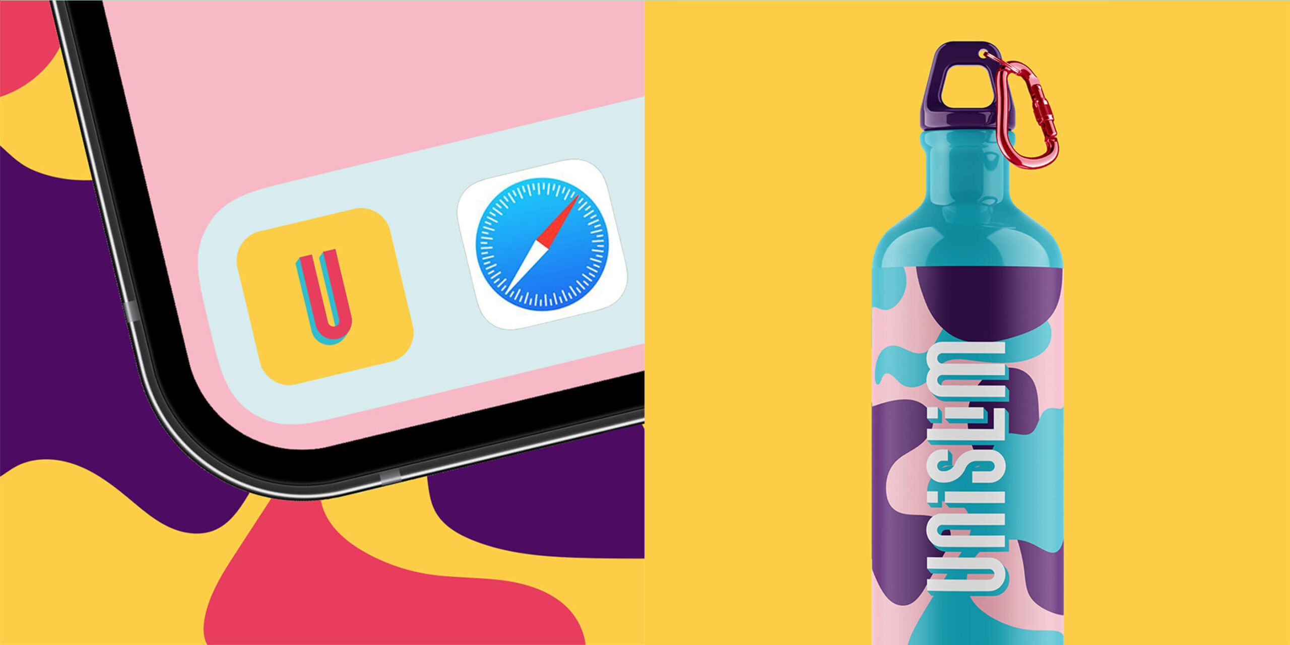
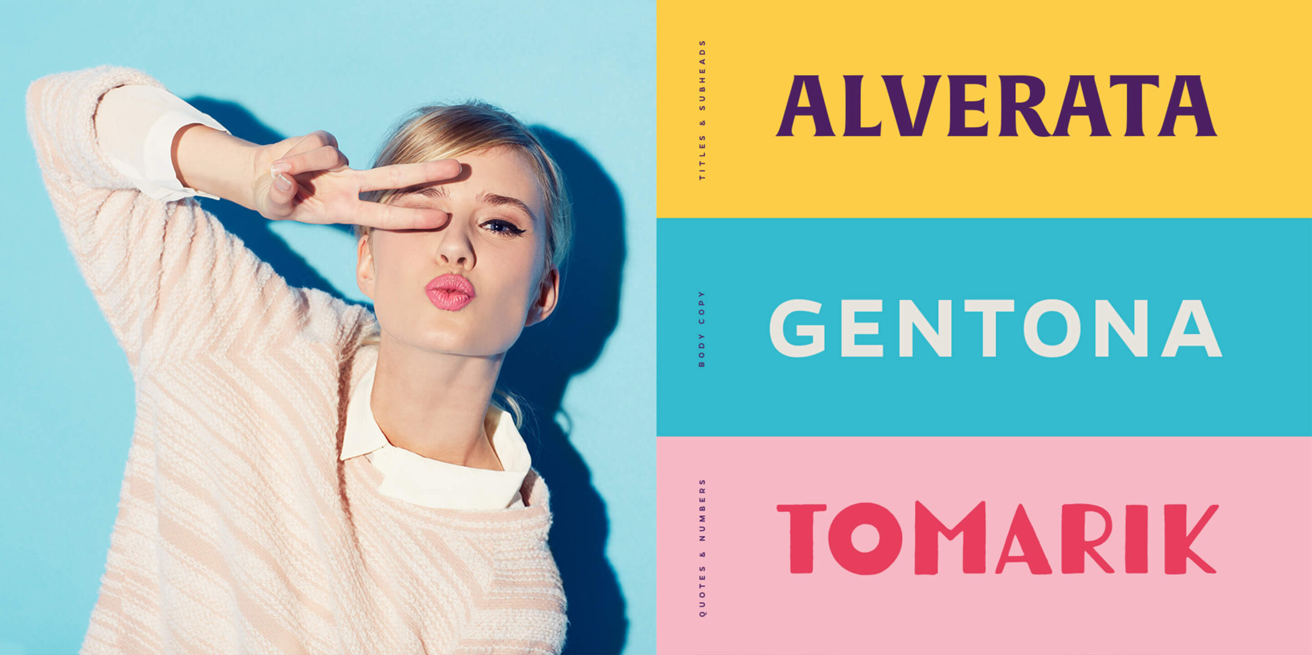
“Let Your Joy Show.” We reenegerized Unislim with a style that exudes nothing but positive vibes. The new logo was inspired by the idea of upward momentum and transformation. Its type is slim, yet confident — which creates balance and harmony, just like Unislim’s approach to health.
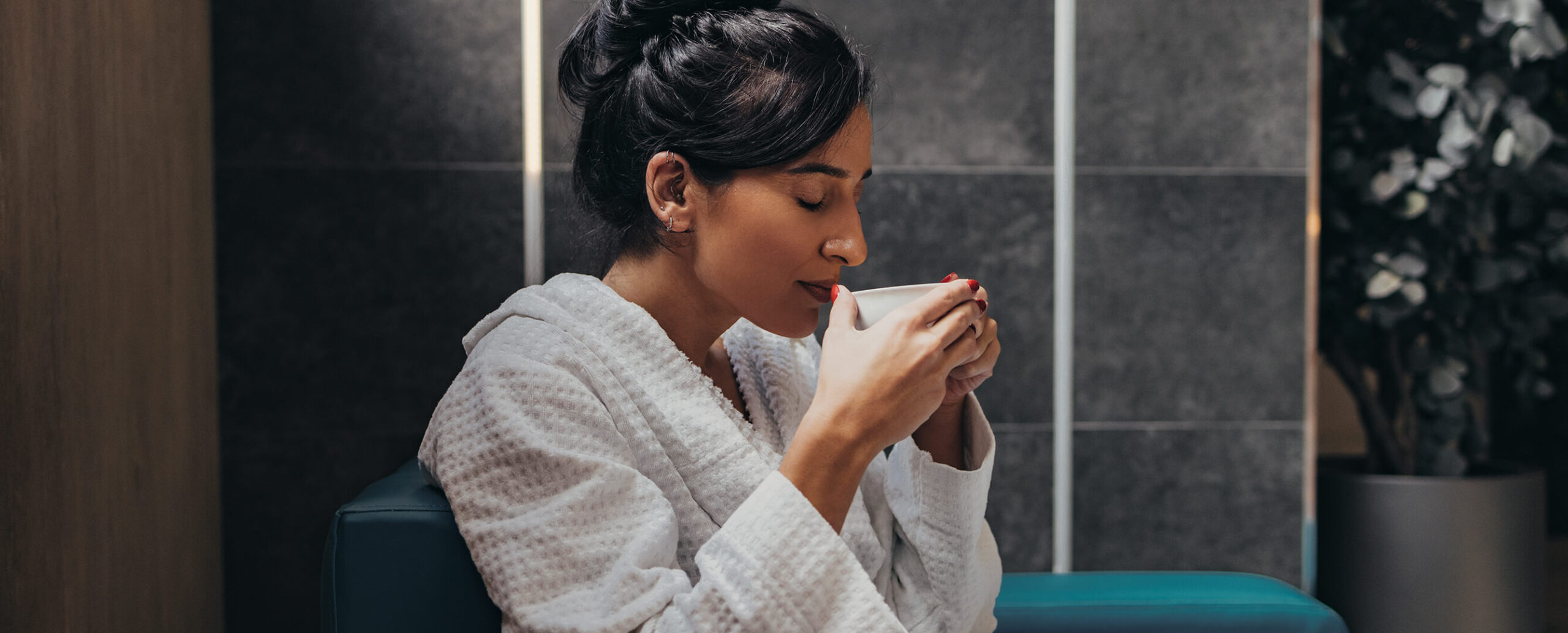
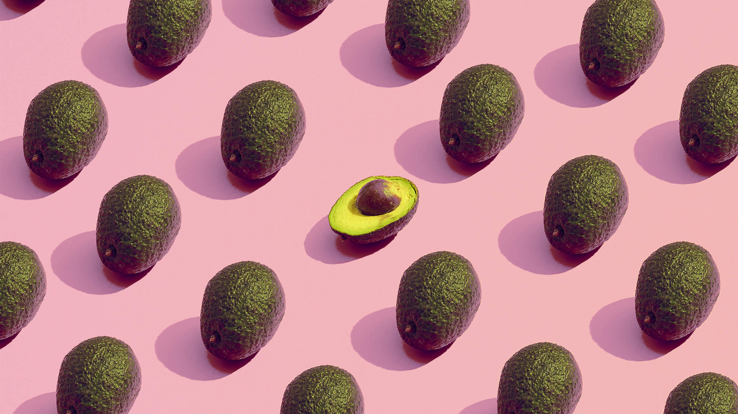
A key part of Unislim’s visual identity is their photography, specifically of their members. We refreshed the photography direction to focus on authentic emotions, a lively lighting treatment and simple backgrounds to let the members shine.
To round out the graphic system, we incorporated amorphous, organic shapes that reflect Unislim’s inclusivity of all shapes and sizes. The malleable patterns represent how the program allows you to mold and sculpt your own body and wellbeing.
The Good We Grew
Unislim’s new visual style helped them speak to a wider audience and change more lives. The refreshed identity created a more welcoming atmosphere for new and existing members to embrace the fun, inclusive community of Unislim.