How We Created Buzz for an Apitherapy Brand
Honey Gardens created a loyal base of consumers who believe in the healing power of bees. Their products are timeless remedies that harness honey’s health-promoting benefits and the elderberry line especially saw explosive growth. But the elderberry category is one with very little differentiation between products on the shelf and in the ways they show up in the wider world.
Our objective: Elevate and differentiate the Honey Gardens visual identity, while staying true to its roots — and create a cohesive story to tell on a sampling tour.
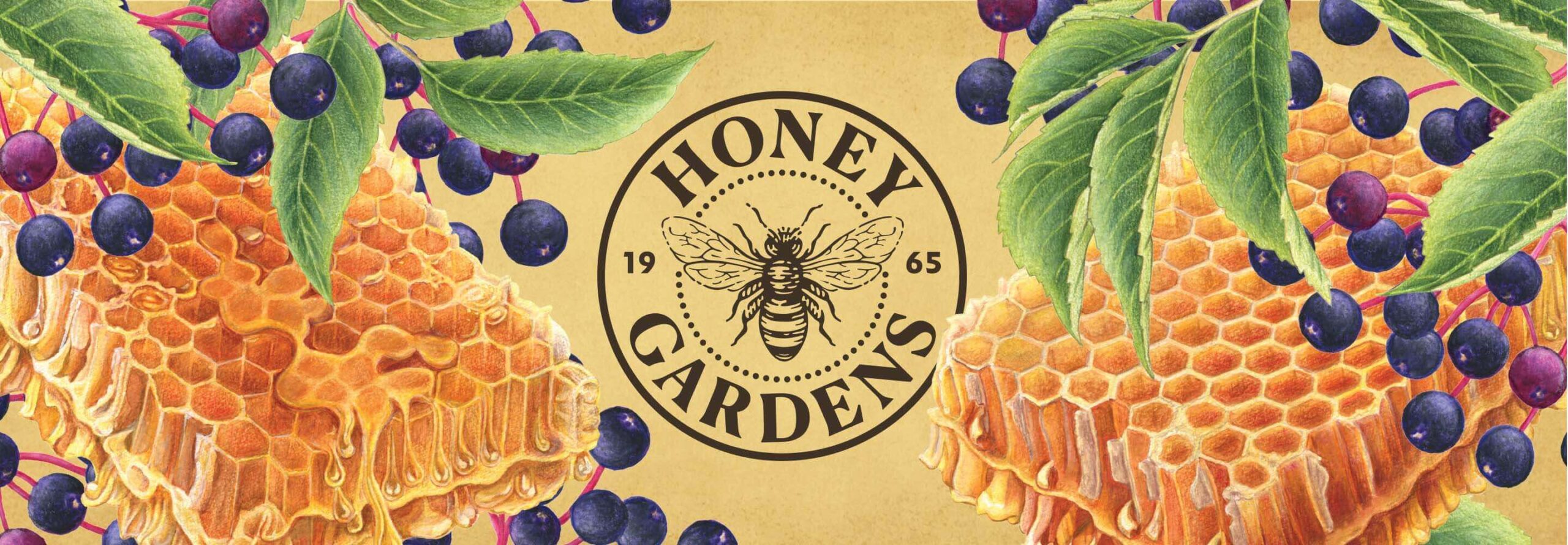
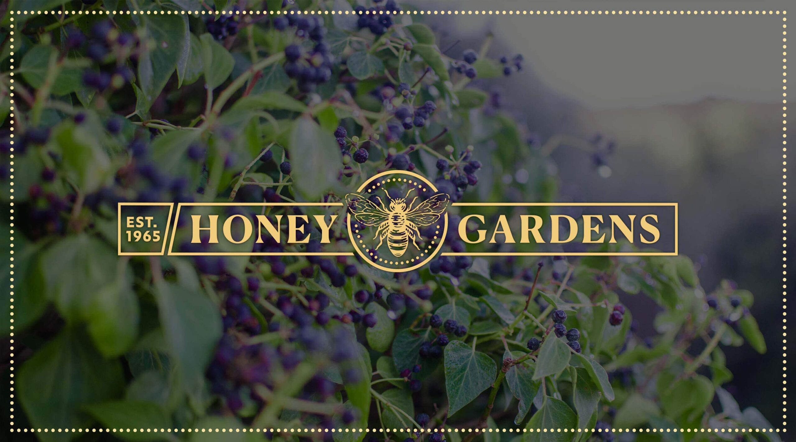
Honey Gardens is on a mission to preserve the healing powers of authentic bee products.
Our Key Insight
Most honey is not authentically raw and sourced from beekeepers. Since Honey Gardens stands for pure honey, we need to help people understand what quality cues they should be looking for.
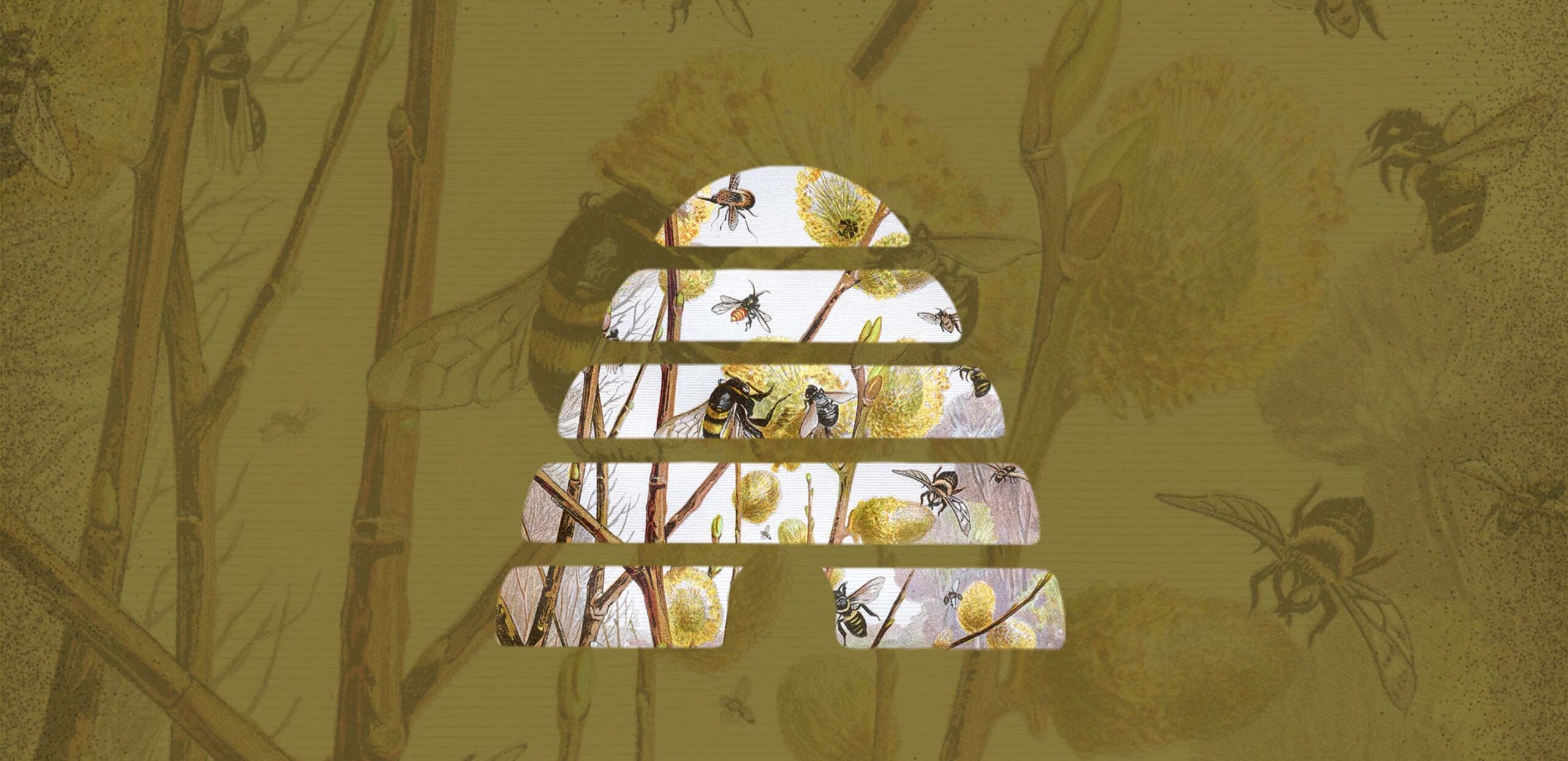
The Uncommon Solution
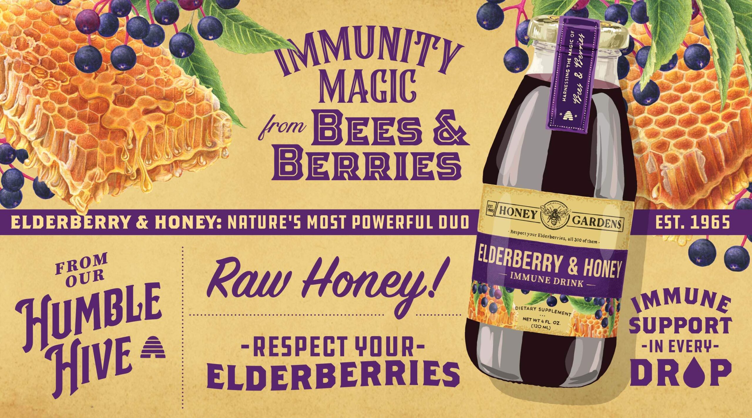
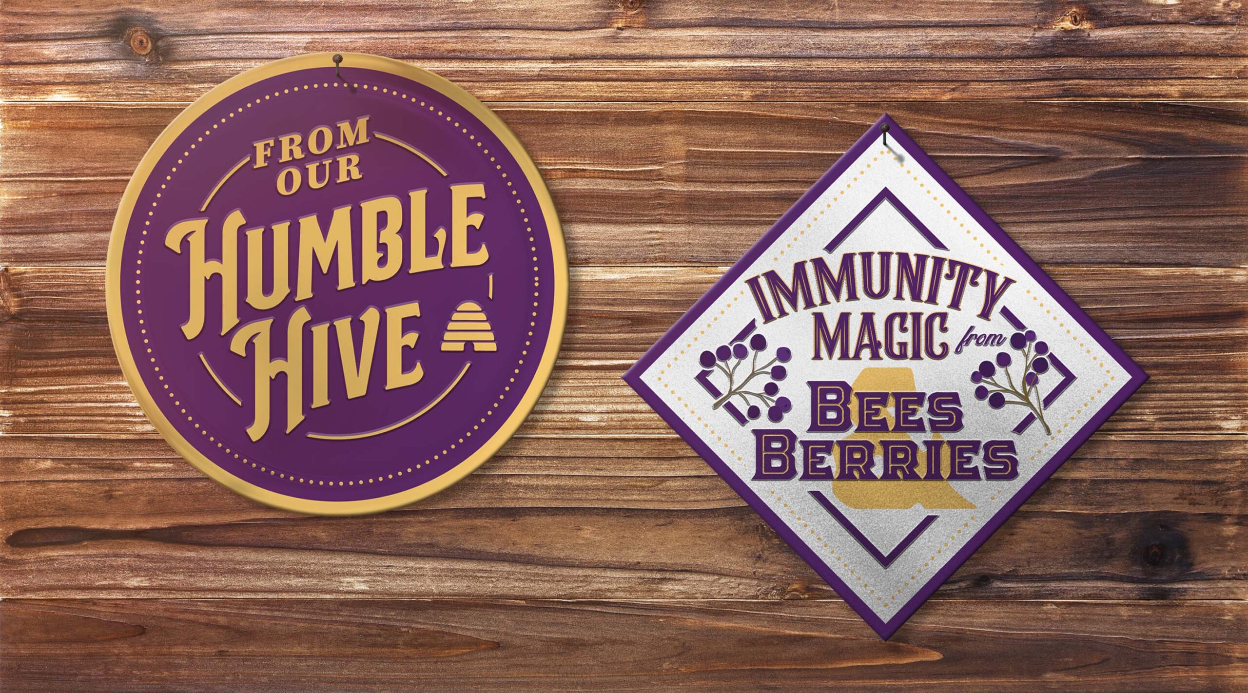
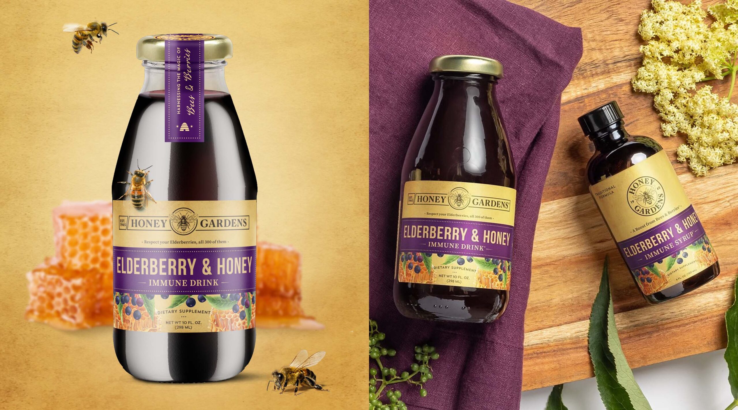
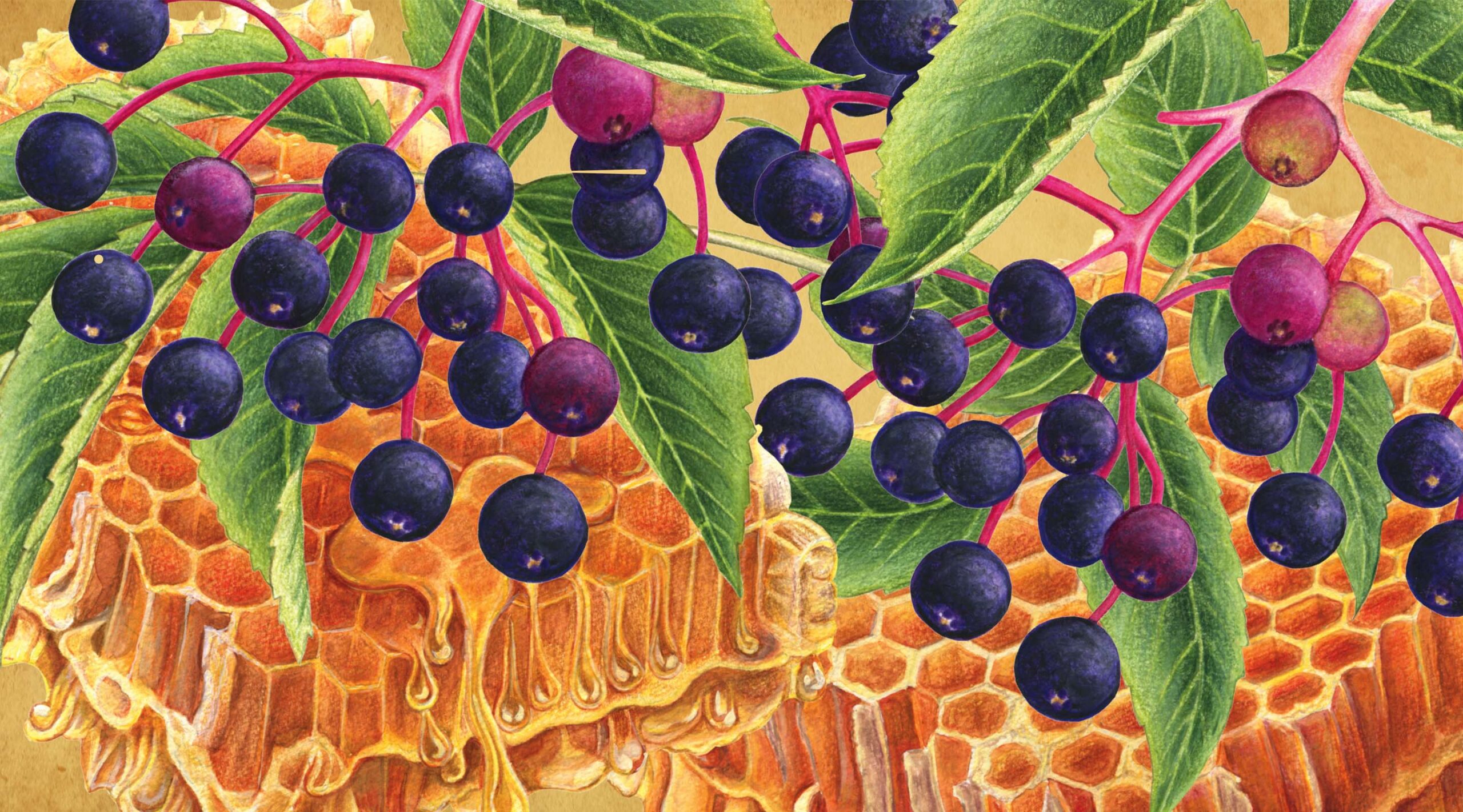
“Nature’s Best Kept Duo.” The unique formula of elderberry and honey offers a super-immune formulation to keep people protected when they need it most. The elevated design and refreshed logo helped better communicate that.
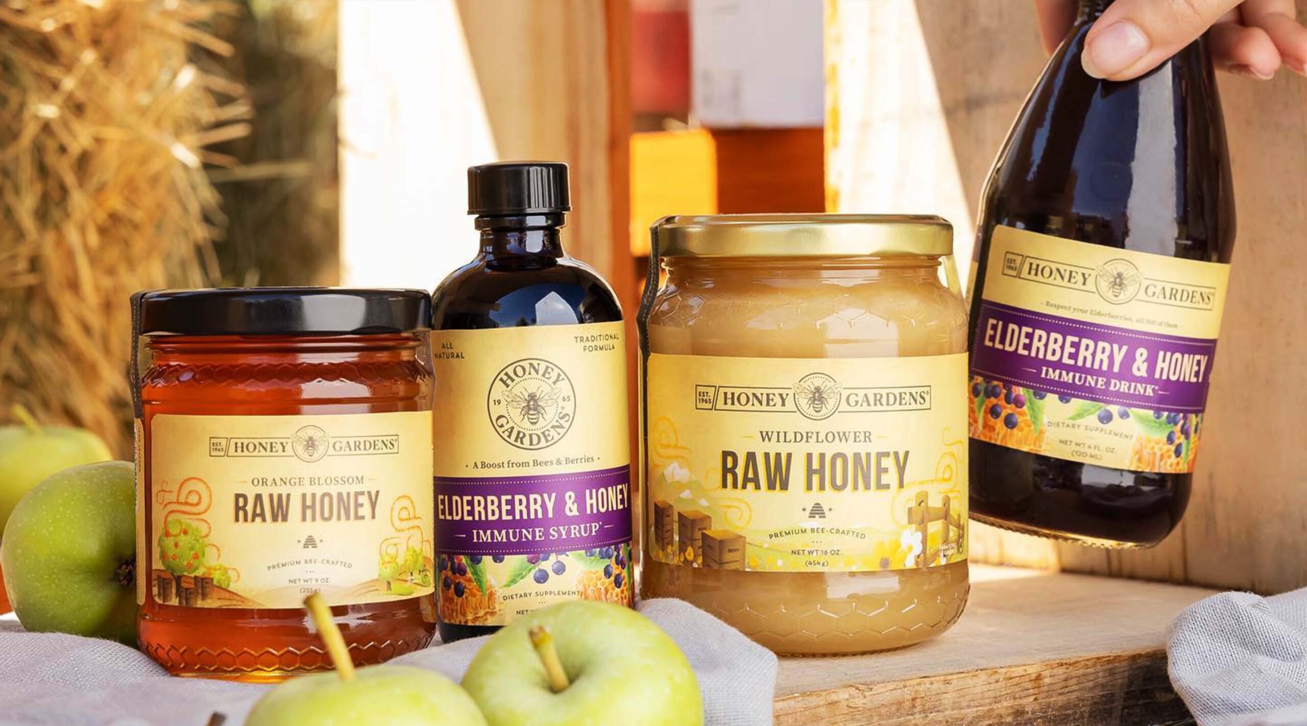
Inspired by the authentic, artisanal qualities of Americana and reliable general stores, we created a look and feel that stayed true to the brand’s roots as humble honey-bee enthusiasts.
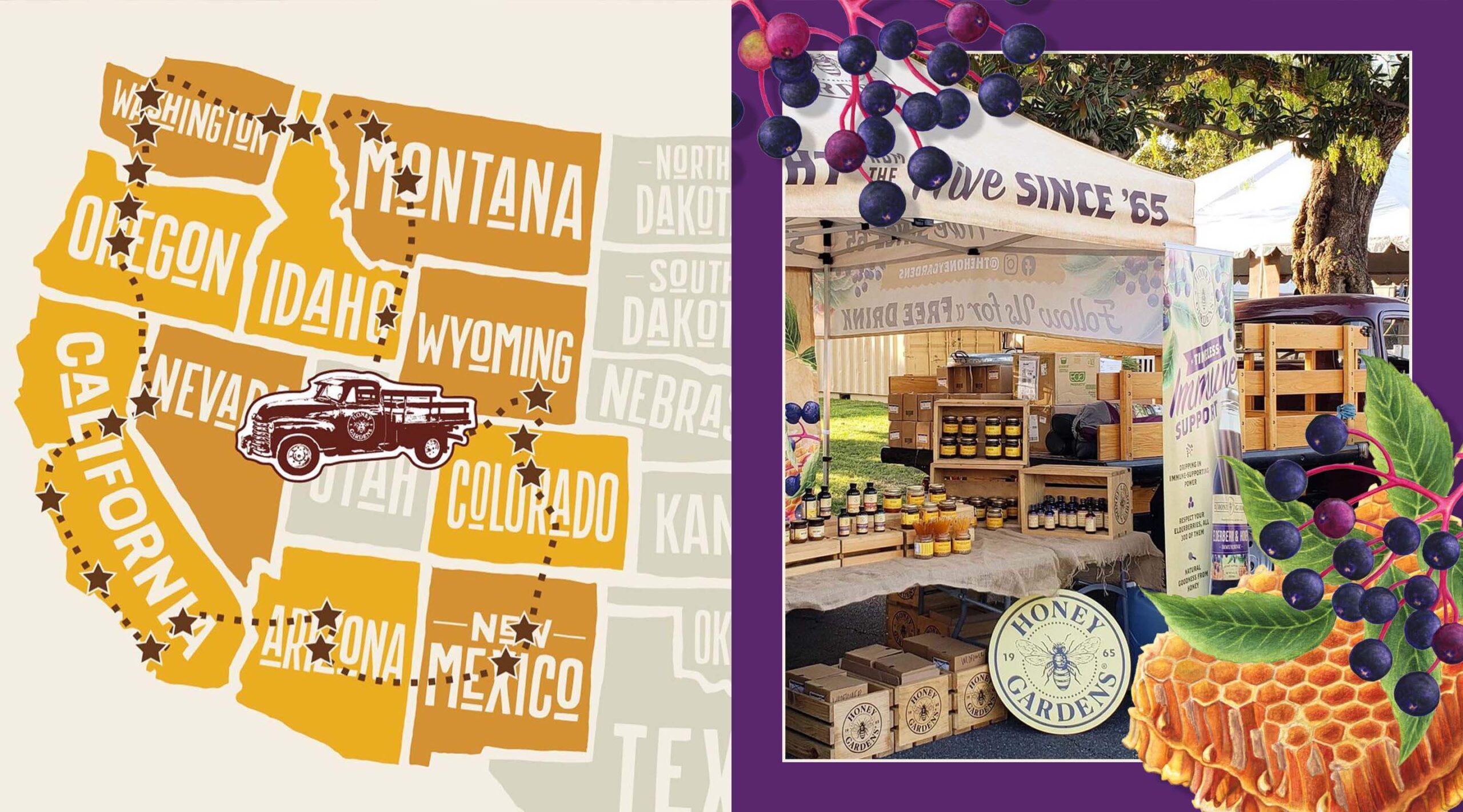
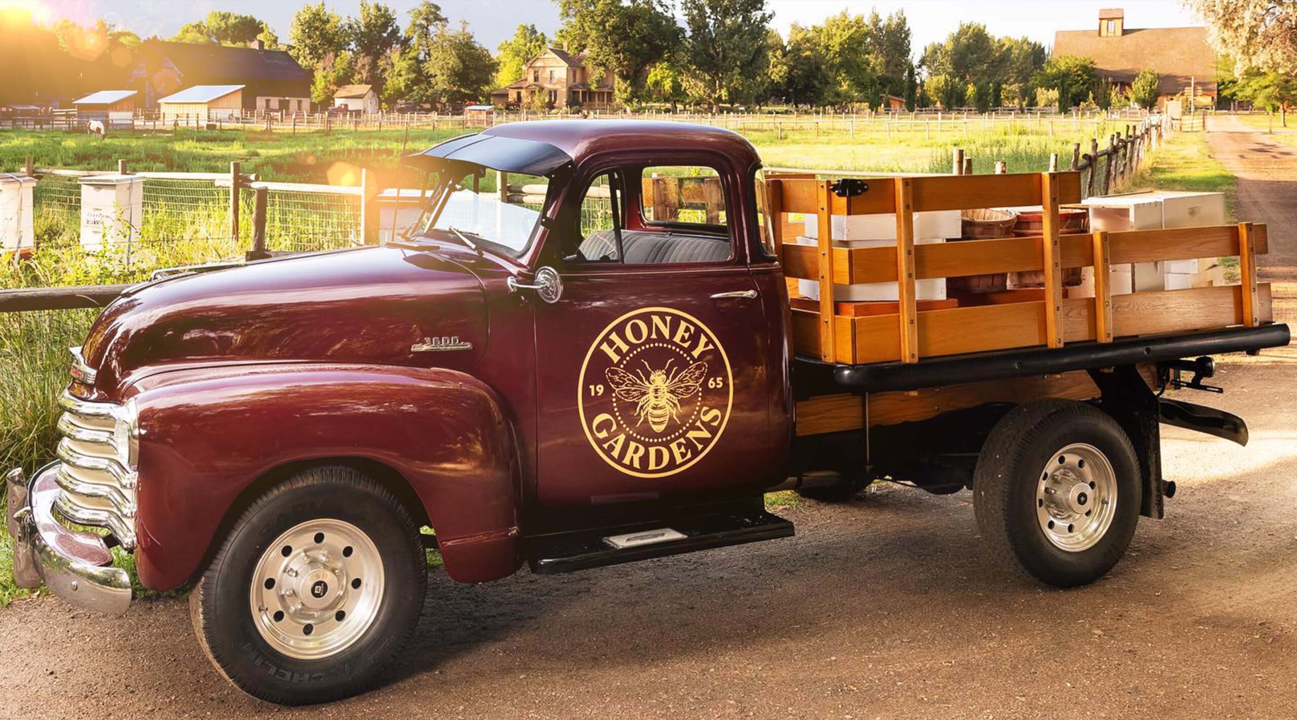
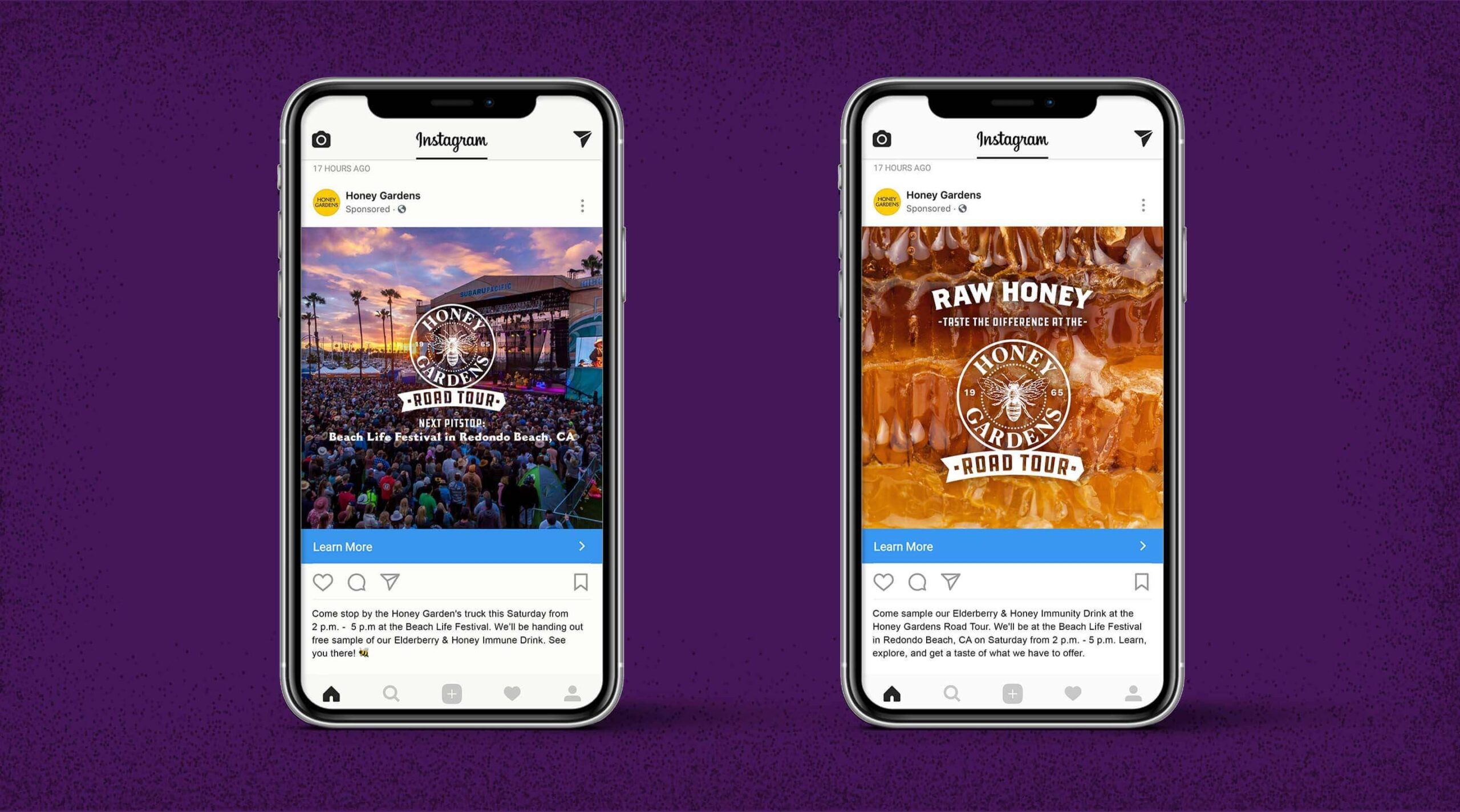
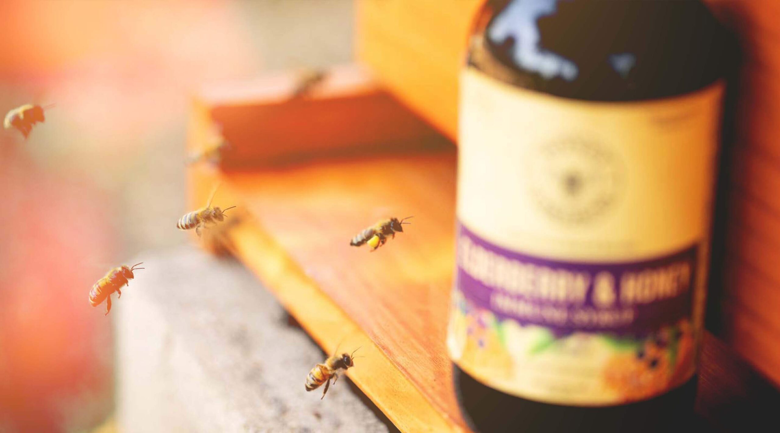
The Honey Gardens road tour aimed to create personal connections with consumers and increase trial of the elderberry line. We designed a truck, tent, sample bottles and banners to make an impact at events that overlapped with the brand’s key market.
The Good We Grew
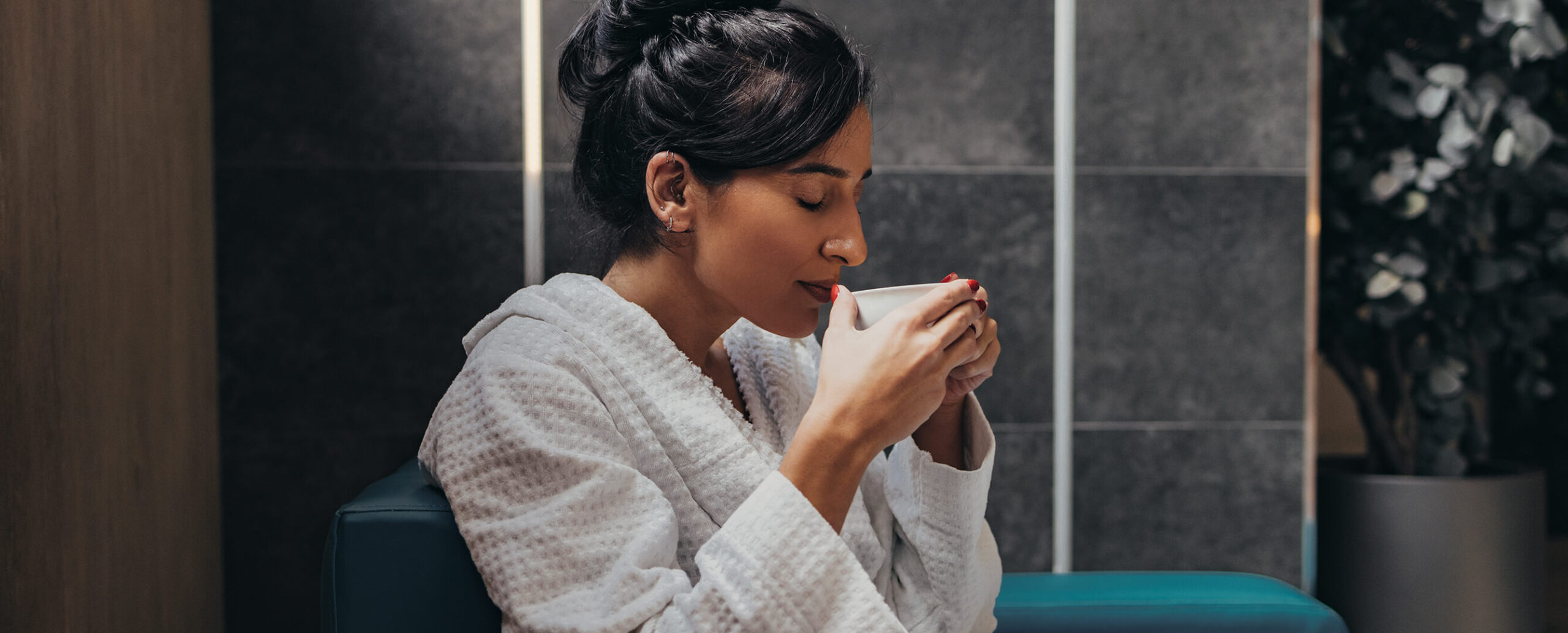
With a differentiated look and feel, Honey Gardens was able to bring the healing powers of authentic bee products to more consumers. During the road tour, they got to bring those healing powers to event-goers who had been feeling deprived of social interaction during the pandemic, but also wanted to feel protected with a strong immune system.