How We Made Purity Pop for an Iconic Bottled Water
Global food and drinks company Danone’s crown jewel, evian, was being encroached upon on two fronts. Big-bottled-water brand spending was on the rise, while smaller, more nimble naturally-flavored waters were threatening evian’s relevance and stand-out in the category.
Our objective: Recapture ground zero for bottled water sales — the convenience store — by redesigning the iconic packaging and visual identity to improve impact and visibility.
With a youthful spirit and a fresh, optimistic and open attitude towards life, evian is on a mission to rejuvenate people and the planet, today, tomorrow and always.
Our Key Insight
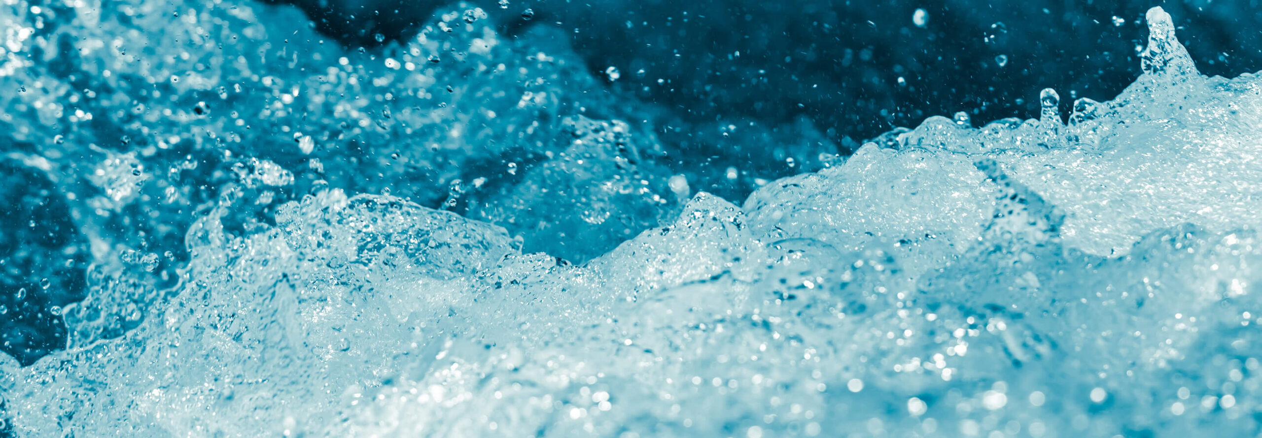
With a few exceptions, bottled water at shelf feels cold, remote and unemotional. Water’s purity is inviting, but also empty. Our target C-store consumers were quite jaded with the category, believing most bottled water is just glorified tap water gussied up with a big marketing push.
To create emotion where it was lacking, we needed to bring forth the weight and heritage of evian to build confidence and reassurance from a brand that’s been there, done that — one with the creds to back up its premium price and position.
The Uncommon Solution
“Nothing But Nature” Bottled water stands apart when it creates emotion. The company that tells a better story — and backs it up with credible facts — creates a myth people can buy. If that myth resolves a tension in people’s lives, it becomes a powerful driver of preference and purchase.
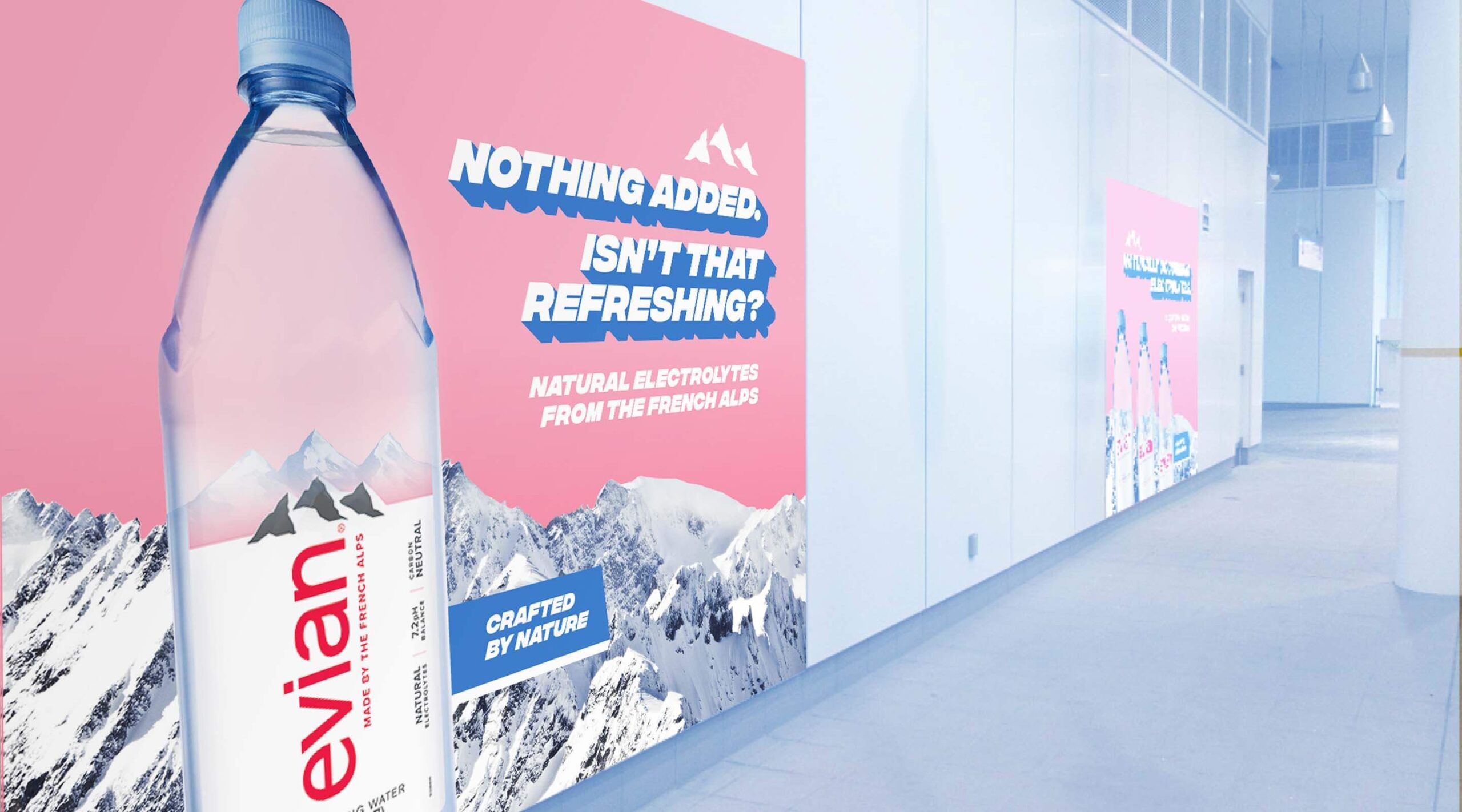
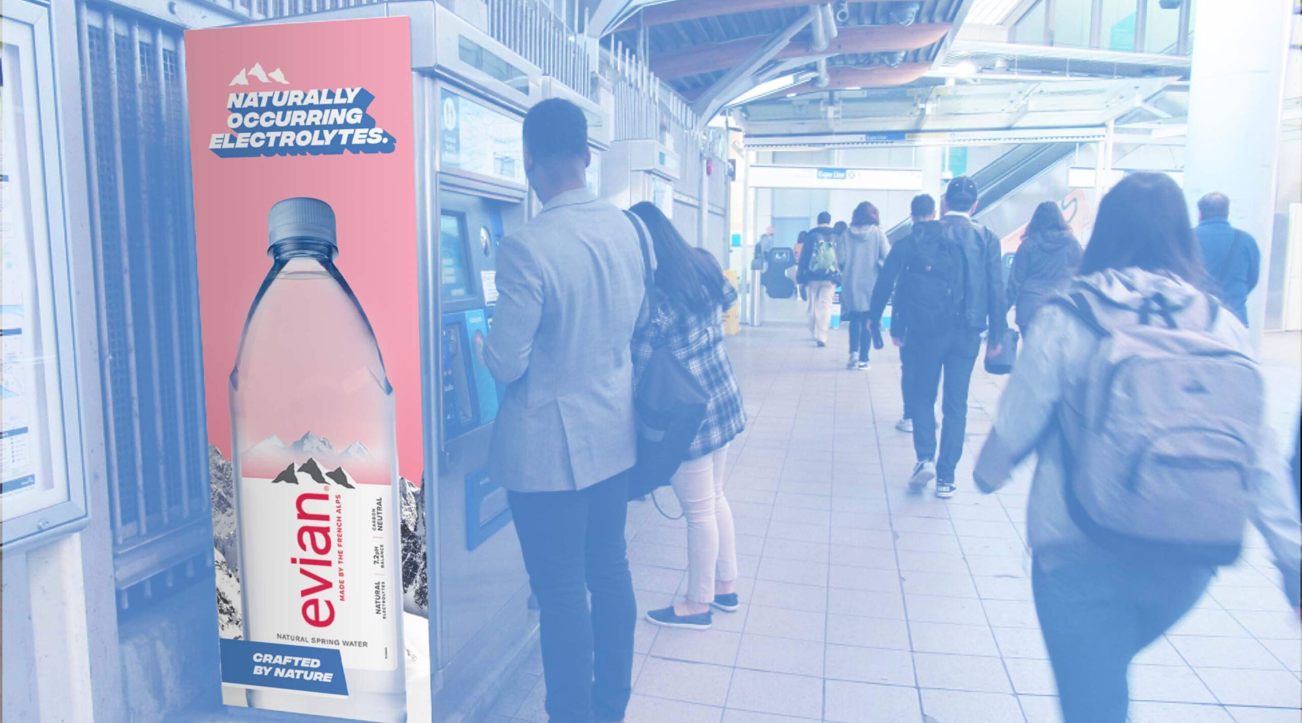
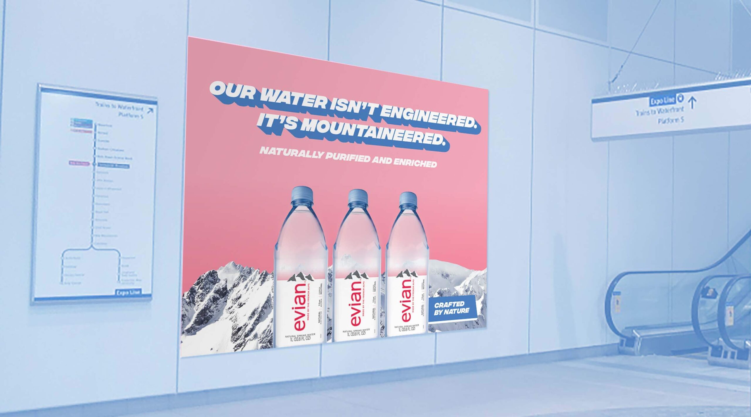
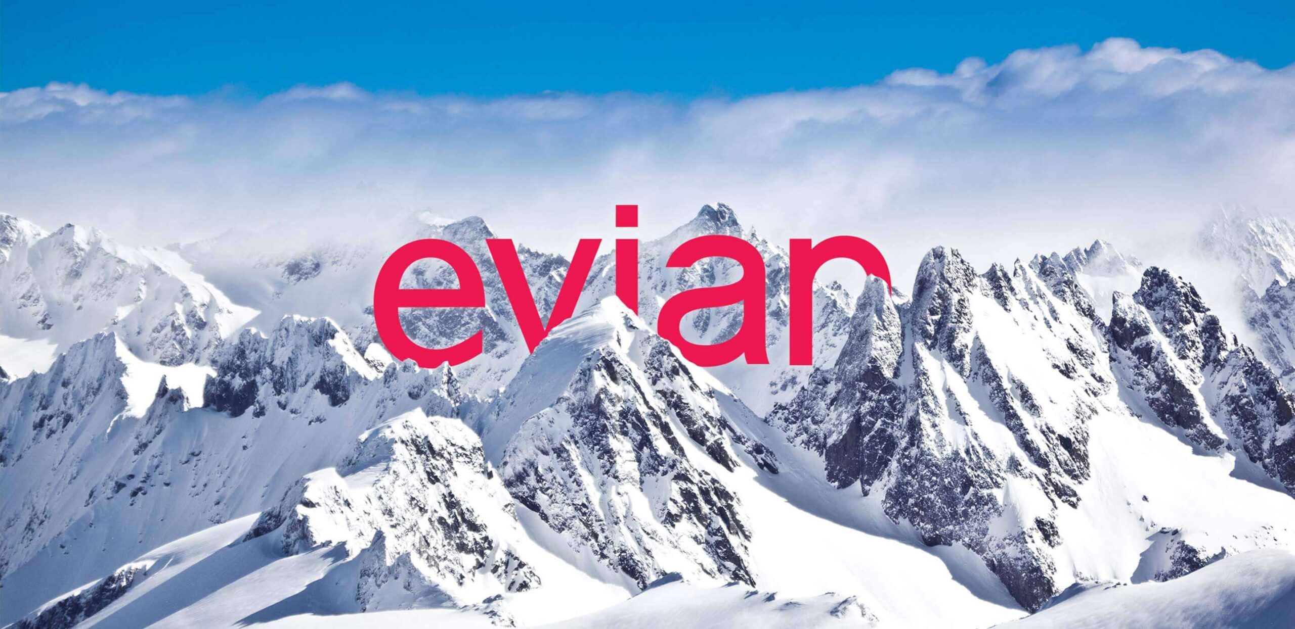
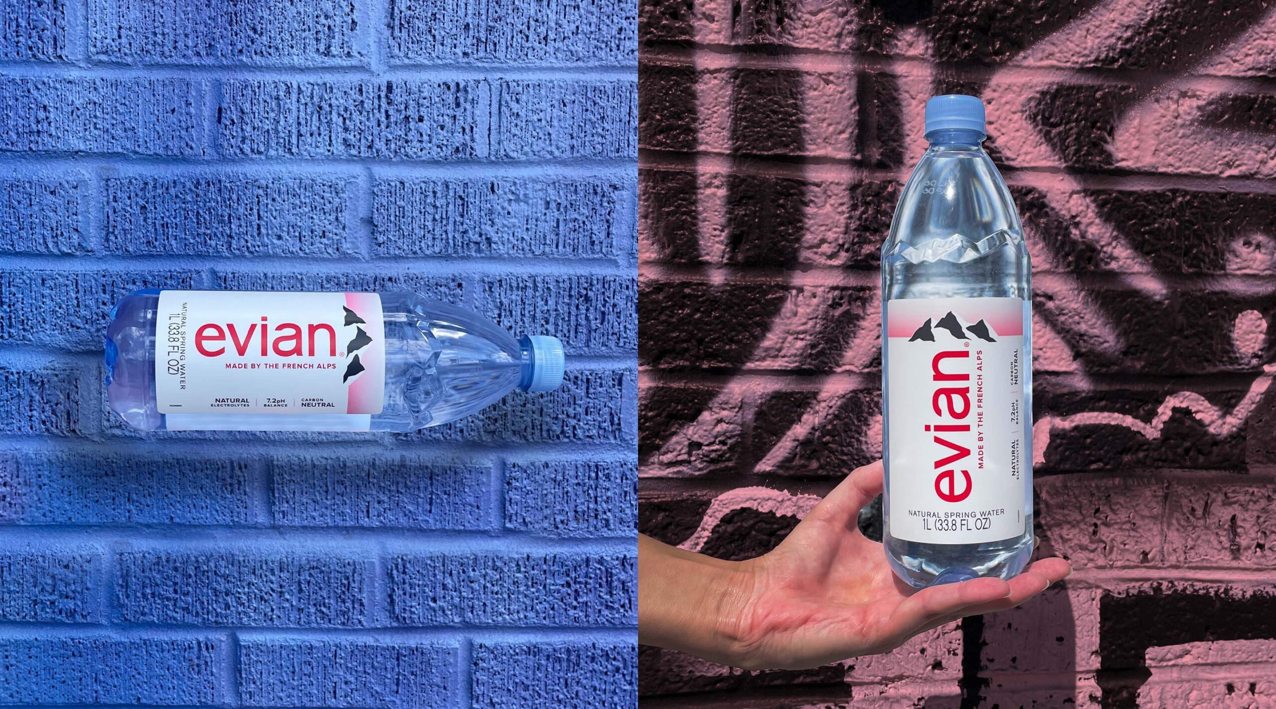
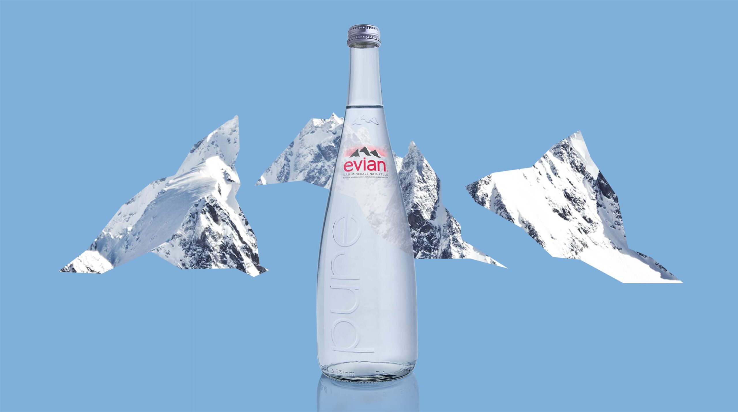
What is the evian myth? evian’s ingredients only come from nature: snow that travels on a 15-year journey through the heart of the French Alps, naturally occurring electrolytes and minerals from glacial rocks. The brand owes everything to nature and is committed to preserving it.
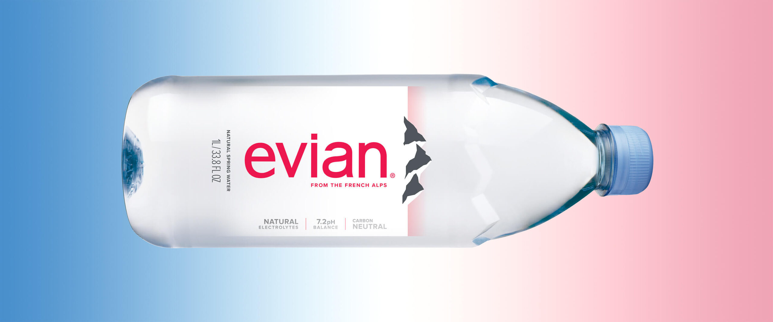
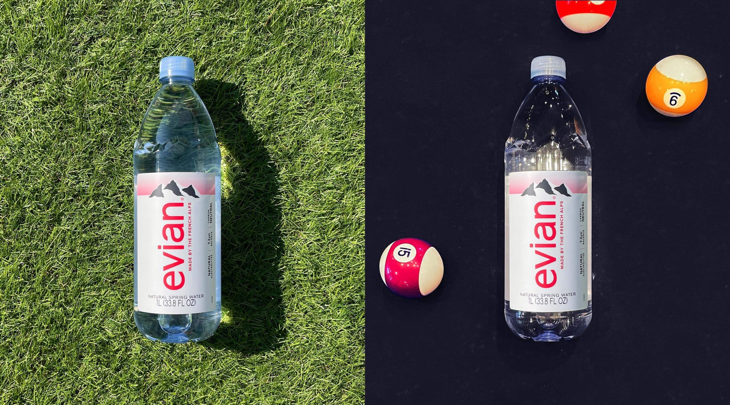
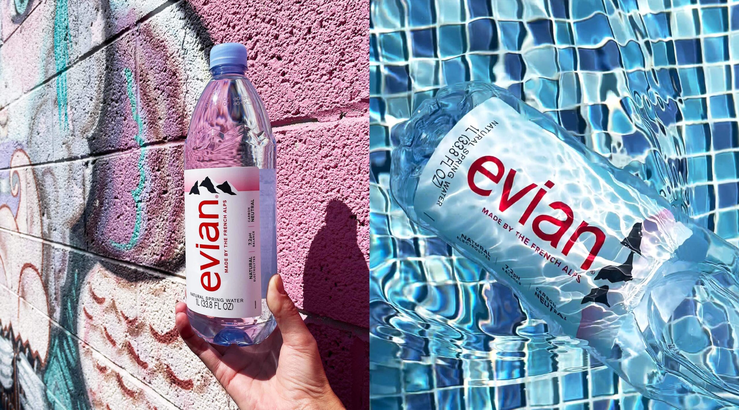
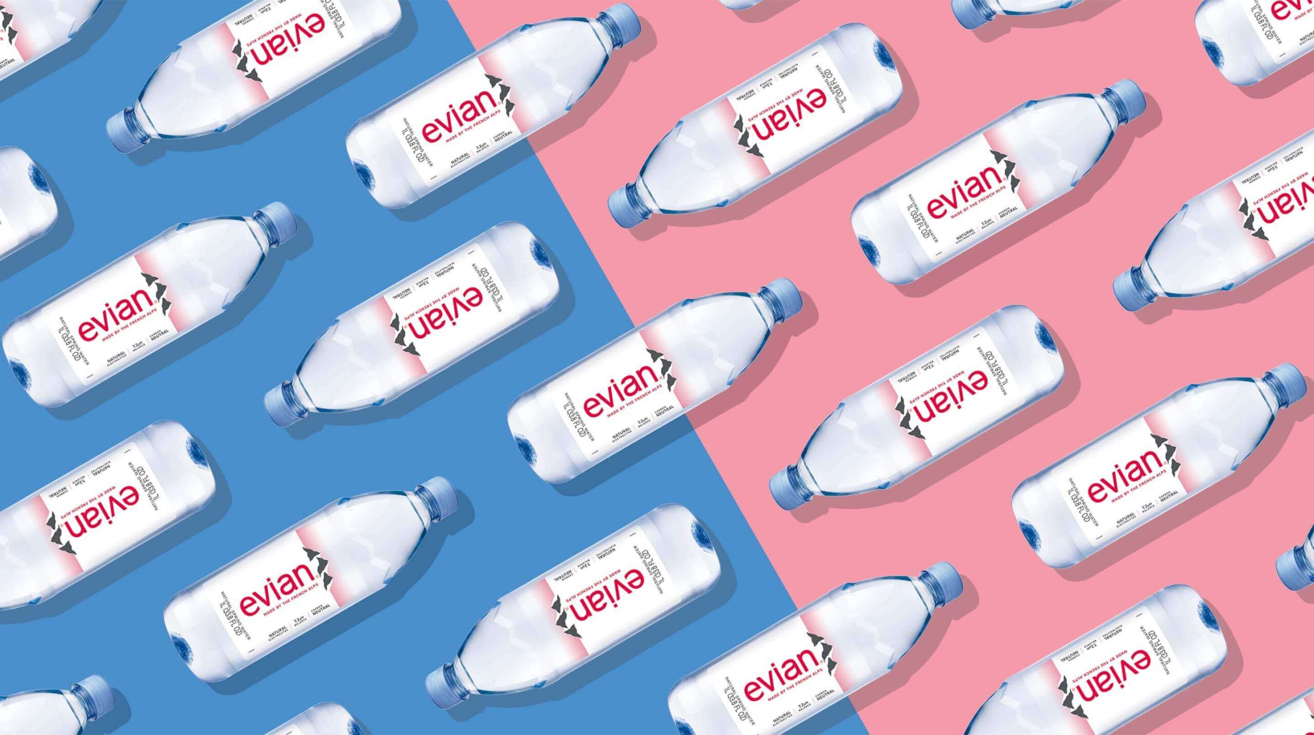
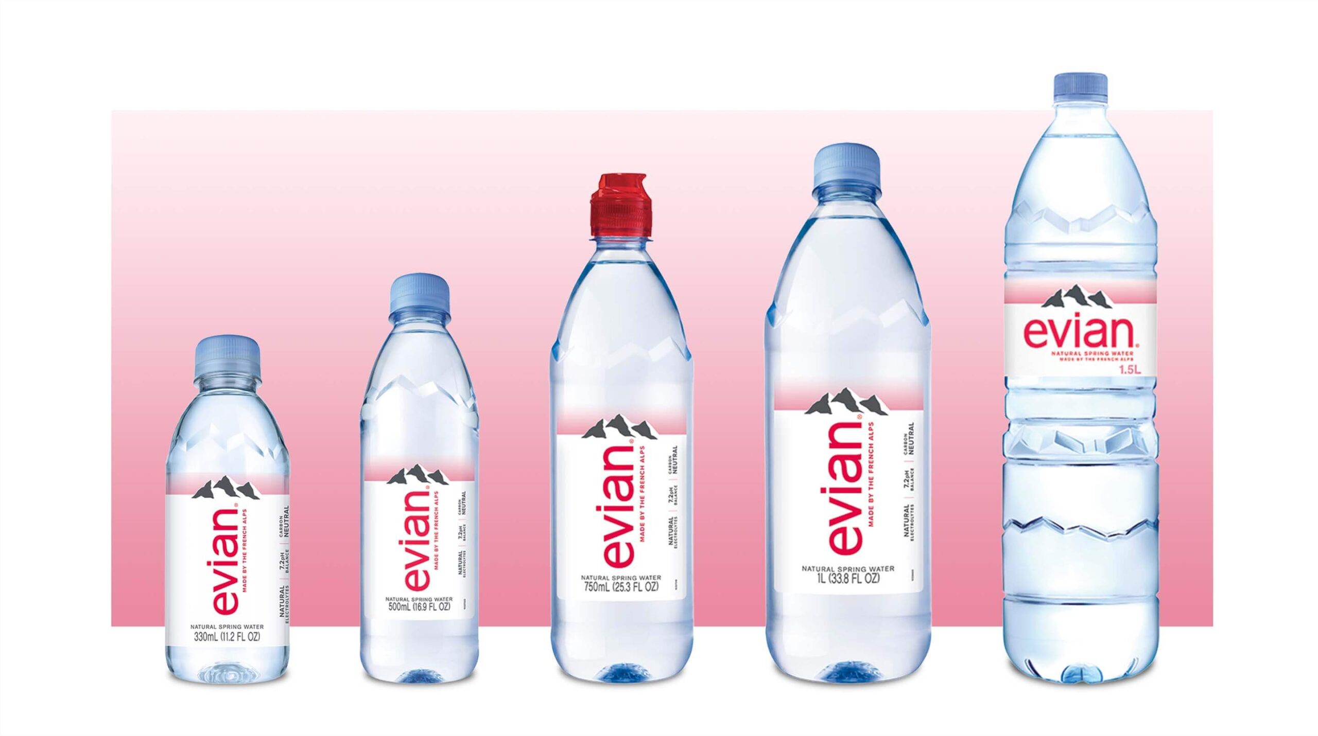
Through our unique packaging execution, we doubled down on the substance itself and its pure origins. Much of the bottle is white, representing the snow. Printed on the inside of the back label is a fade from clear at the top to white to a pink sunrise over the mountains — representing the dawn of a new day. The mountains are printed on the front label and act as a dimensional overlay to play off the sky.
The Good We Grew
By boldly heroing its natural ingredients and making the product’s purity the standard by which all other brands should be measured, evian became the water that speaks for itself. Not to mention, the crisp white color greatly increased visibility and drove sales at convenience. So pleased was evian with the results that the new design was leveraged across the EU and became the new global brand look.