Packaging Launch: Health Warrior Protein
On the heels of a huge success with its 100-calorie, snack-sized Chia Bar, Health Warrior decided to launch a more-substantial nutritional bar to complement it.
The Health Warrior Chia Protein Bar is roughly double the size of the compact version and targets an audience of active adults looking to increase their protein intake. Available in four flavors—Dark Chocolate Coconut Sea Salt, Peanut Butter Cacao, Lemon Goldenberry and Almond Honey—it contains three times the protein (10 grams), which is derived from plant-based sources. In this supersized version, amaranth and quinoa accompany the chia.
The challenge for LRXD, our Denver-based advertising/design agency, was to create an eye-catching identity for the Chia Protein Bars, one that could serve two rather oppositional objectives: a) differentiate it enough from the original Chia Bar so it was clear this was a new and distinct offering, and b) retain enough visual cues so the Chia Protein Bar would still fall under the Health Warrior umbrella. The creative needed to reflect Health Warrior’s spirited, authentic, aspirational, motivational, passionate, gritty and humble core values and appeal to its sweet spot of female buyers.
And since all Health Warrior products use real food as the primary ingredients, it was important for us to showcase this vital brand attribute in packaging that fits the modern, grab-and-go lifestyle—in a very crowded, competitive category. Additionally, we needed to increase the visibility of Health Warrior itself since many shoppers believed “Chia Bar” is the brand when it is actually the name of that initial product.
After listening to Health Warrior’s objectives and the brand’s unique proposition, we honed in on a design directive that would bridge the aesthetics of the ancient and modern worlds. Packaging would reflect the wisdom of Aztec and Inca warriors and the latest nutritional findings.
Ultimately, we designed a visual language that conveys a Modern Primitive aesthetic. The single-sale bars are encased in wrappers that have the look of unbleached and graced with pre-Guttenberg printing. The typeface is highly modified from an existing font—and used all-caps to be reminiscent of ancient Greek lettering. Its spare, flourish-free lines have the advantage of appearing both classic and modern. It is slightly distressed to give the impression that packages were inked using a hand-carved wooden stamp.
Secondary elements were designed to make the packages pop. The ecru-colored canvas is decorated with minimal bursts of colored text and swipes in vibrant hues (gold, turquoise, terra cotta), which distinguish each SKU and communicate key benefits of the bars, which are gluten free, omega-3 rich and high in fiber. Retail display boxes use beauty-shot photographs to showcase each bars’ natural ingredients, such as nuts, berries and dark chocolate.
Our packaging concept helped Health Warrior’s Chia Protein Bar stand out on store shelves, look mouth-wateringly delicious and come across as the most nutritious protein snack on the planet. It also served to unify the bars with the Health Warrior brand name without sacrificing the benefits of chia. We achieved this objective by placing Health Warrior’s name and logo above the Chia Protein Bar label at roughly the same size, and separated the copy units with a color-coordinated perforated line. To further tie the products to the true brand name, we rotated the words “Chia” and “Bar” 90 degrees, which gave “Health Warrior” and “Protein” a subtle, yet direct, direct visual connection.
Related Articles
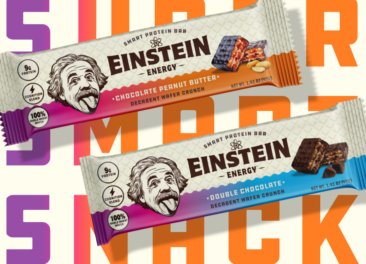
Designing a Premium Nutrition Bar Brand Around Einstein’s Legacy
Read More
Common Good Drives Awareness for CENTR Enhanced Beverages Through Unique Experiential Brand Activation
Read More