Brand Relaunch: GoodBelly
With its sleek black carton and emphasis on a unique probiotics feature, GoodBelly had distinguished itself from other fruit juices in the natural channel. But the brand’s marketing team had a gut feeling it was ready for wider distribution beyond specialty food stores. To communicate to this broader audience, the company hired LRXD to design new cartons for its quart- and single-shot-sized juice products to speak and appeal to these new customers.
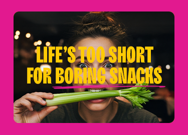
Shoppers who peruse natural-foods stores had always responded positively to GoodBelly’s packaging, which conveyed it as a functional product that aids the digestive tract. However, company research found a hitch as it was about to pitch the product to the masses: Since probiotics were the packaging’s priority, most consumers couldn’t identify GoodBelly as a juice despite complementary images of produce and a glass of the colorful drink. It needed to boost its flavor appeal.
We decided to play down the biology lesson and focus more on taste to achieve the perfect balance of form and function. The carefully planned rollout took more than a year from focus group to repositioning to grocery store shelf. GoodBelly swears by consumer research and data-driven analysis, so it conducted focus groups to craft art and copy so new customers could instantly understand what the cartons contain and how it could positively impact their everyday health.
With those findings, LRXD designed the packaging to give proper weight to each of the product’s benefits: Its probiotic function, great taste and dairy-free benefits. One finding that affected this balance: The fact that 60% of customers eat yogurt regularly. This meant the non-dairy message did not need to be emphasized as much as previously thought. Also, different sizes of GoodBelly can be found in different store sections — quarts generally sell in dairy next to yogurt and other dairy based probiotics, while shots are available in the supplements section. Packaging for all products needed to be consistent in appearance.
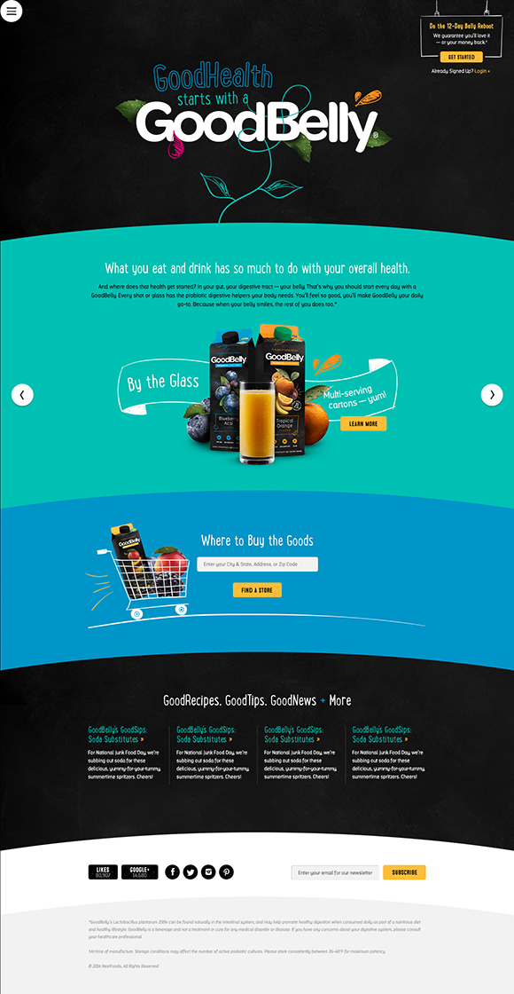
LRXD maintained the package’s eye-catching black background, and chose to replace small, static pictures of produce and juice glasses with cornucopias of fruits and vegetables that appear to burst off the boxes. With the redesign, LRXD simplified the message and made it consistent across all SKUs. A new line runs in small type above the Helvetica-type GoodBelly label now: “Drink daily for healthy digestion” — and an explanation of the new brand positioning — “GoodHealth starts with a GoodBelly” — is featured prominently on the side.
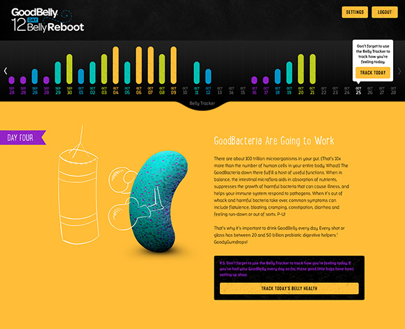
Along with the packaging overhaul, the drink’s website got a redo too. The redesigned destination acts as, “The tasty way to set your health in motion.” The look complements the new packaging’s aesthetic, provides a highly interactive experience on every page and illustrates the healthy benefits of balancing intestinal microflora in bite-sized morsels. The site includes a 12-day Belly Reboot challenge and Belly Tracker app to track what goes in a GoodBelly drinker’s mouth and how it makes their belly feel.
We invite you to visit the new GoodBelly site at www.goodbelly.com.
You can read more about the rebrand in BevNET.

Related Articles
Common Good Drives Awareness for CENTR Enhanced Beverages Through Unique Experiential Brand Activation
Read More
Capturing the Transformative Power of Wellness Retreat Canyon Ranch in a Brand Film
Read More