LRXD Helps Make Over Your Pasta Aisle with It’s Skinny Packaging Redesign
It’s Skinny doesn’t look like your average pasta. And with only nine calories, zero gluten and a low-carb Japanese plant as its main ingredient, it doesn’t act much like the pasta you’re used to either.
What It’s Skinny does have in common with pasta is a special knack for capturing an astounding amount of flavor, an advantage that LRXD — when tasked with developing a new strategy and packaging for the brand — was immediately drawn to. Whether it’s twirled together with marinara and meatballs or floating in a giant bowl of rich broth, It’s Skinny can host all the comforts that a traditional noodle can. Simply put, It’s Skinny isn’t simply a diet food for people who want to lose weight. It’s a way for fresh thinkers to boldly indulge even more of their favorite flavors, without worrying about a carb-loaded base.
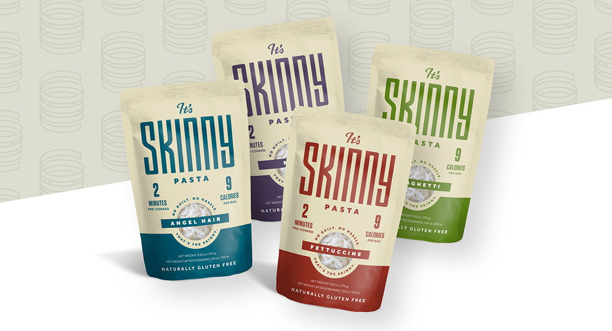
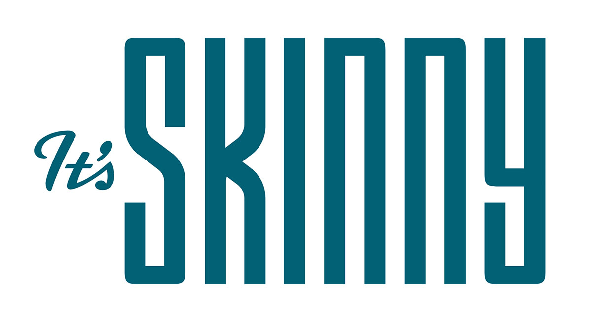
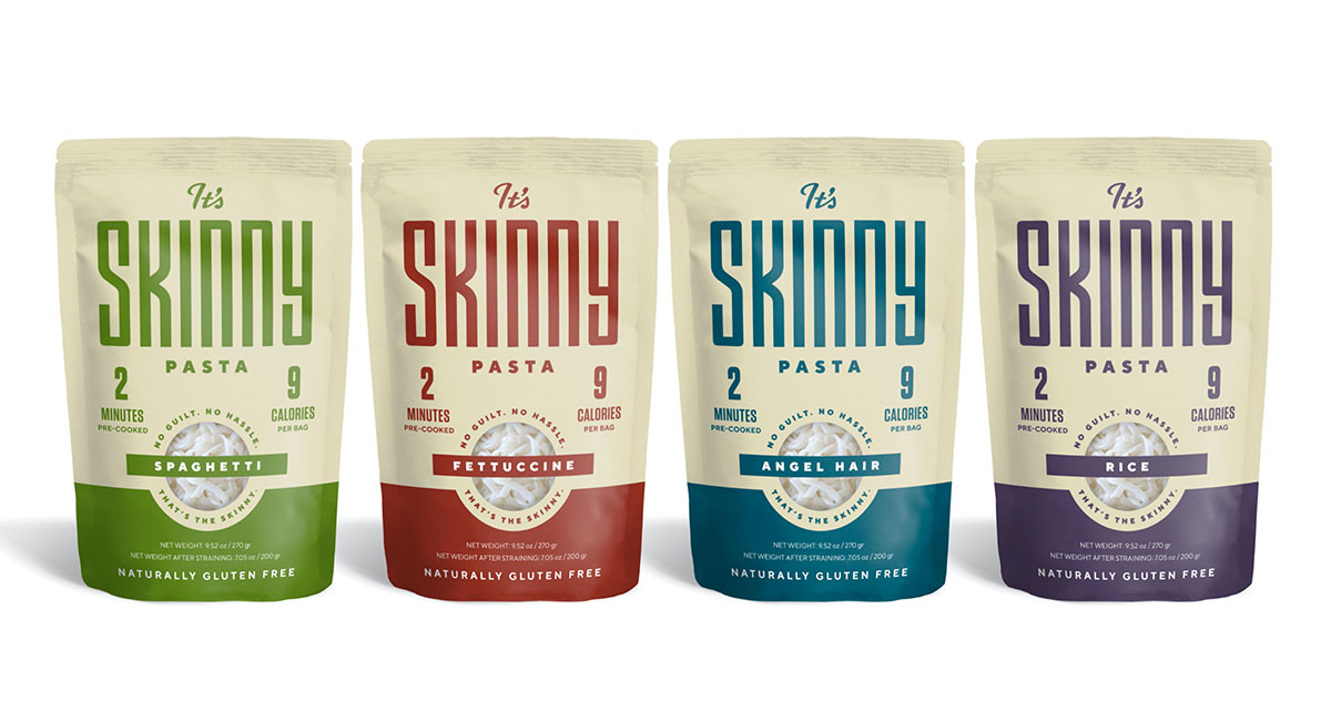
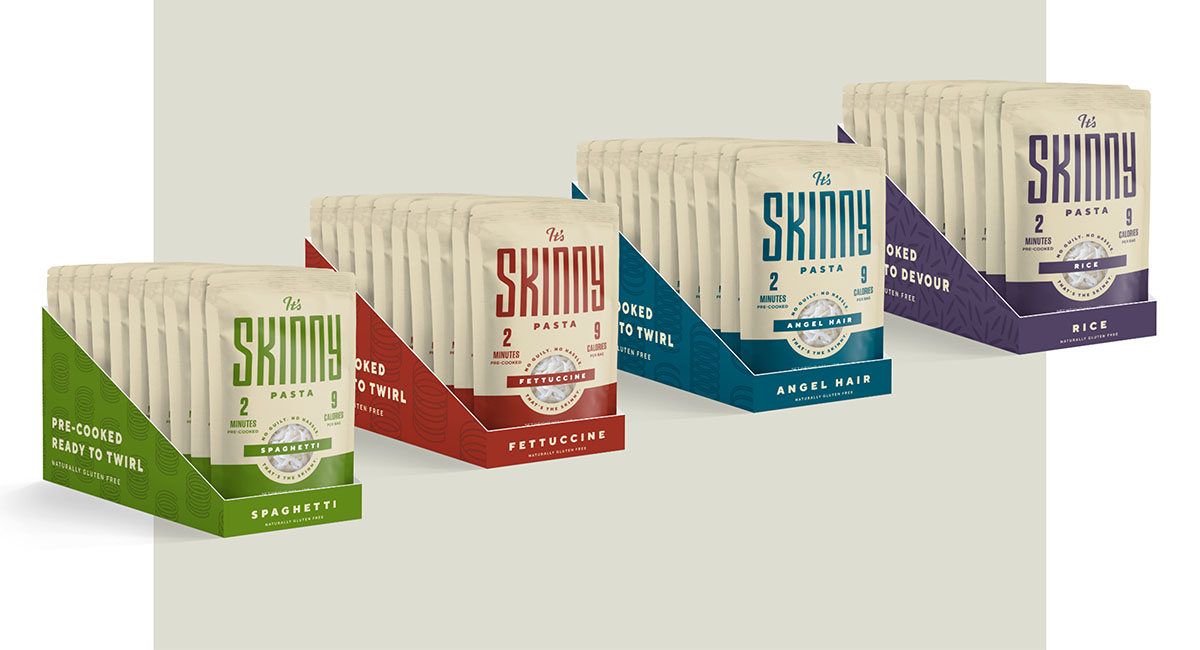
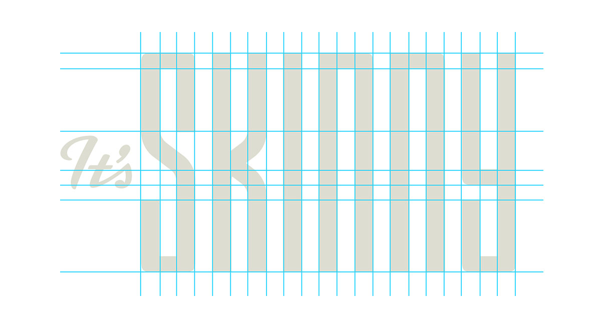
With that strategic angle in mind, we set out to create a new package that could overcome the stigma of “diet” food, starting with the word “Skinny.” Beginning with a new logo, we employed thin letterforms built with ‘noodle’ shapes. Though the letters are thin, from a distance, the even spacing gives the allusion of ‘filling the space’ — which is what It’s Skinny noodles do in your belly to create a feeling of fullness. The strong look and feel communicates that the word “skinny” can be a healthy and fulfilling way of living and gives an otherwise frail word some positive power.
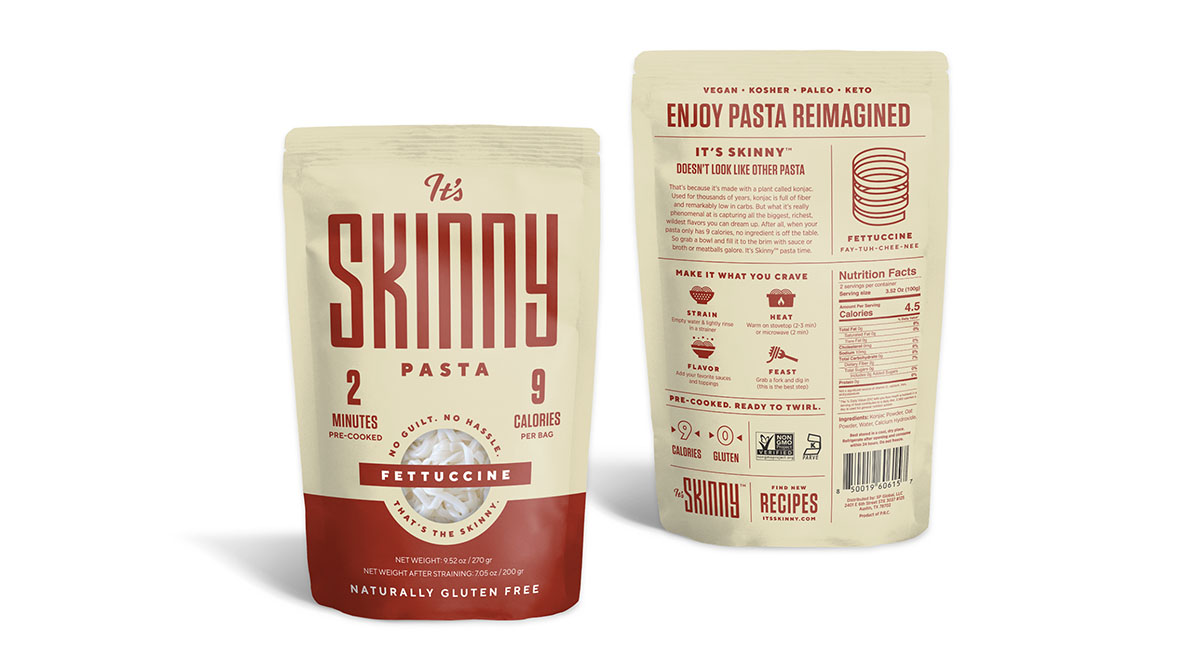
Color-coded boxes, paired with stylized noodle illustrations, were used as quick identifiers for the brand’s unique noodle shapes for consumers at shelf. The back of the package serves as an infographic, communicating what the pasta is and how cooking differs from that of a normal noodle.
It’s Skinny provided the opportunity for us to work on a unique project and we can’t wait to see what they can accomplish. Keep an eye out for it in your pasta aisle.
Related Articles
Designing a Premium Nutrition Bar Brand Around Einstein’s Legacy
Read More
Common Good Drives Awareness for CENTR Enhanced Beverages Through Unique Experiential Brand Activation
Read More