How We Reset the Tradition of Classic Comfort Food
Dieting often results in eating guilty pleasures for comfort. And one of the most popular guilty go-tos? Pasta.
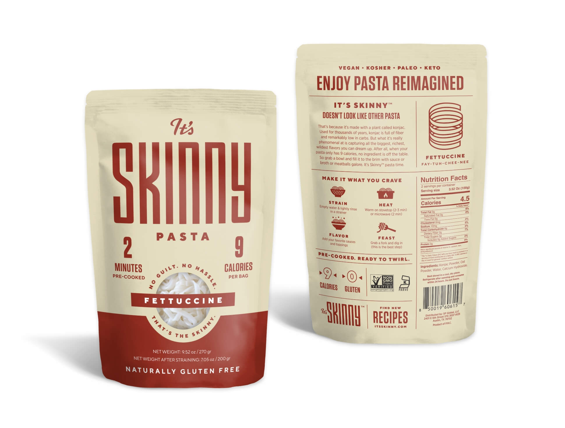
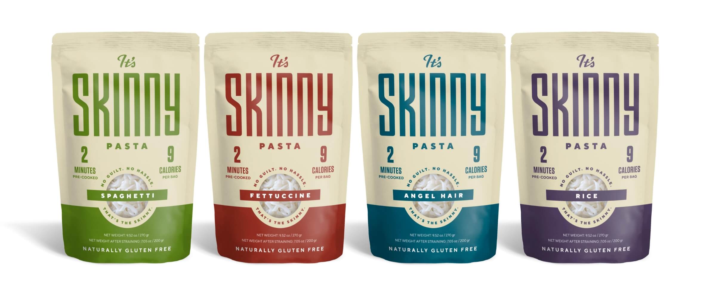
To take guilt out of the equation, pasta was reimagined with a 9-calorie noodle. It’s Skinny is a plant-based pasta made from konjac — an ancient root vegetable that is naturally low calorie. This unique noodle challenged how people think about, cook and eat something as well-known as pasta.
But with the pasta aisle jam-packed with healthy alternatives, It’s Skinny needed packaging that would break through the cluttered shelves.
Our objective: Develop a new brand identity and packaging to drive trial of It’s Skinny Pasta among better-for-you meal seekers.
It’s Skinny is on a mission to help people live a healthy life that’s more fulfilling (and filling).
Our Key Insight
This unique noodle will appeal to the freshest of thinkers — people who celebrate fresh ideas, fresh rules and fresh ingredients.
The Uncommon Solution
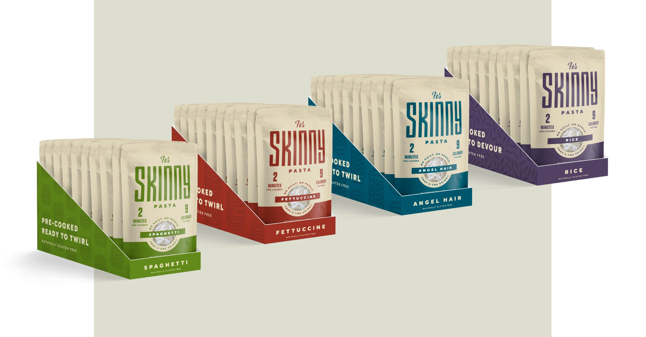
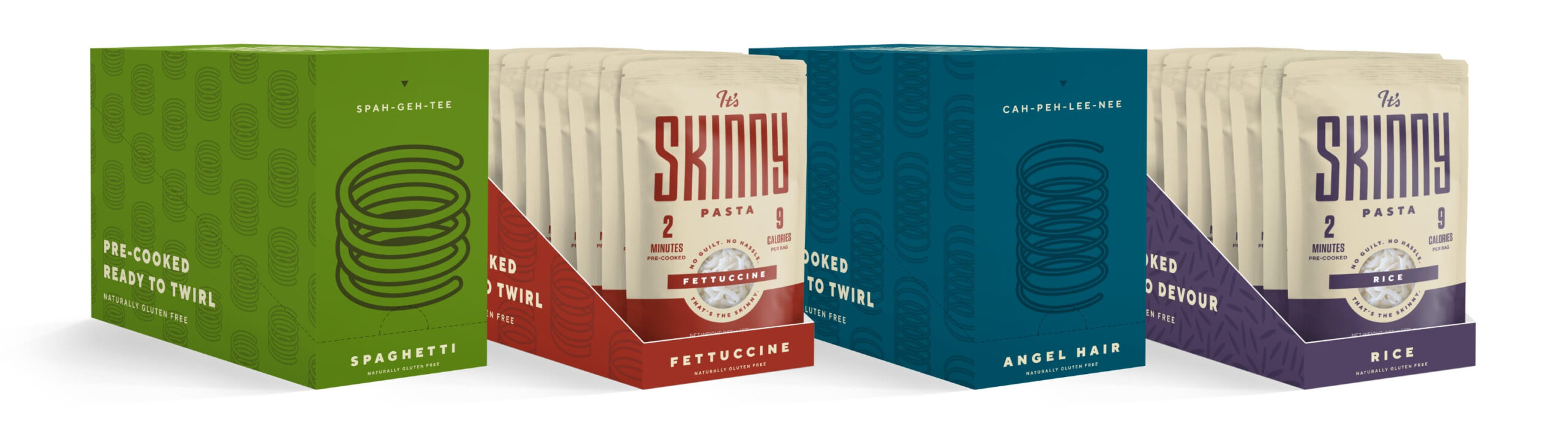
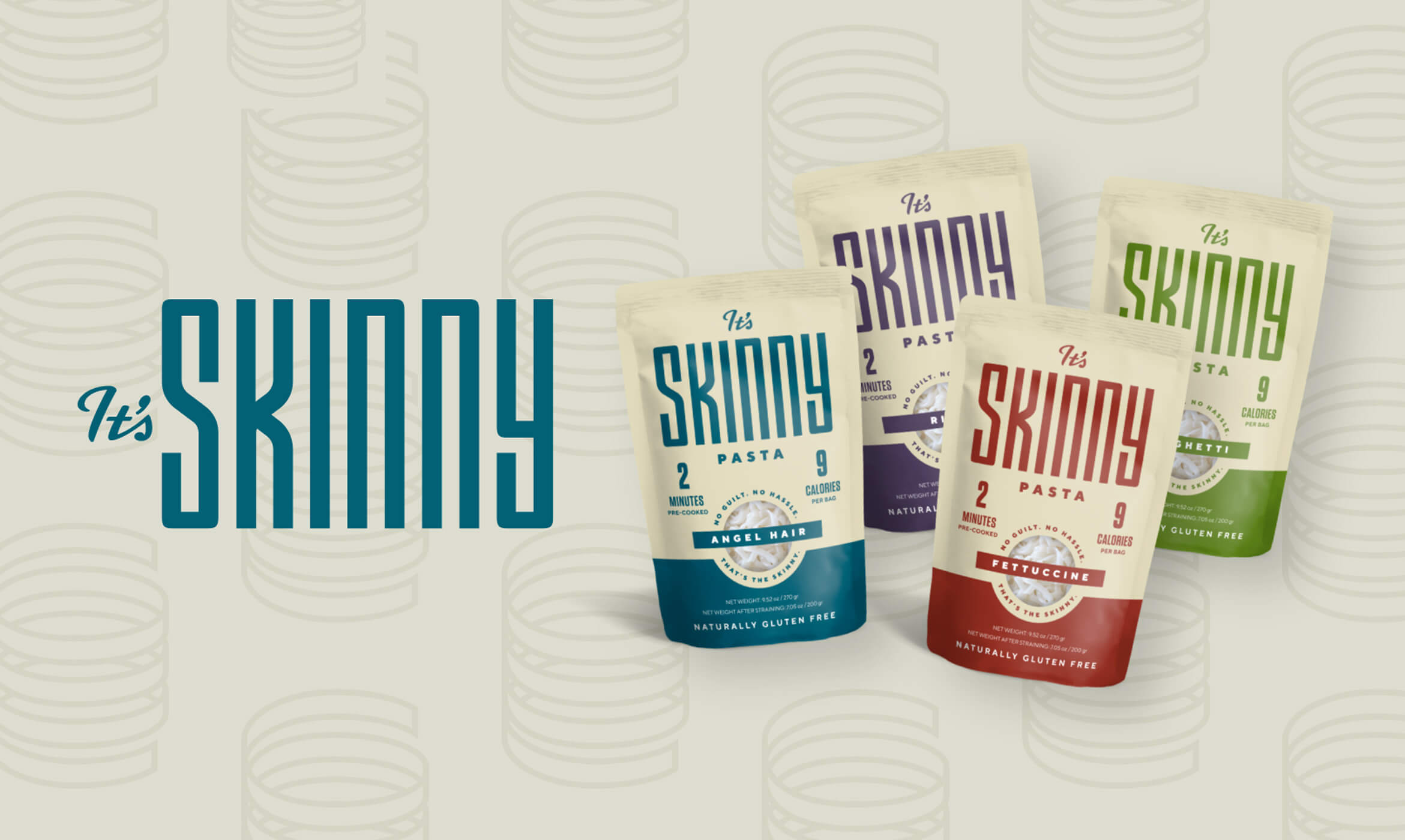
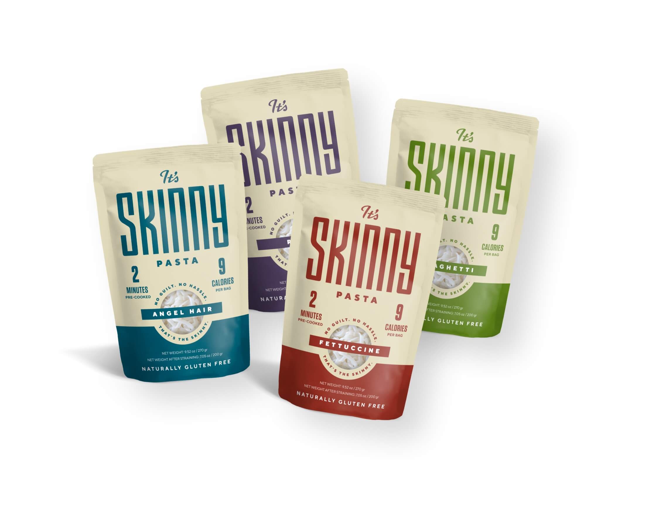
“Eat Lighter. Live Fuller. That’s the Skinny.” The design we developed drew in the consumers bold enough to pursue freshness in everything they do (and eat). A consistent cream-colored background created a brand block on shelf, while the accompanying colors took cues from the source of the product: the konjac plant.
We also created a new logo that is skinny and proud of it. While “skinny” is typically attached to negative stigmas, we gave it a makeover, just like the brand did for pasta. The logo transformed the word into a badge of confidence and strength — something to be sought by only those bold enough to defy the confines of tradition and embrace a healthier, more invigorating way to eat and live.
The Good We Grew
The fresh look allowed It’s Skinny to reach more fresh-thinking consumers with their no-guilt, no-hassle product. People with specific dietary needs and preferences discovered the brand and were able to enjoy their favorite pasta dishes once again.