How We Refreshed the Pioneer of California Craft Cider
ACE Cider has been making high-quality, approachable cider since 1993, when it became California’s first craft cider brand. With three decades of expertise, bold flavors and a legacy of innovation, ACE had carved out a loyal following and a reputation as a true category pioneer.
But as its portfolio expanded into sessionable, imperial and alcohol-removed lines, its packaging lacked the cohesion and clarity to tell a unified story. Our objective: develop a comprehensive brand identity and packaging system that could strengthen ACE as a master brand, cut through crowded shelves and feel fresh, relevant and distinctly ACE.

ACE Cider is on a mission to craft the highest-quality, fruit-forward ciders that taste as good as they make you feel—refreshing, gluten-free and with no added sugar.

Our Key Insight
Despite its pioneering heritage, the brand’s identity and packaging were no longer keeping pace with the times or its innovation. People loved the bold flavors, but they weren’t always clear on what ACE stood for as a brand. What we uncovered was that ACE’s greatest strength lay in its clarity and confidence: bold fruit, bold flavor, bold legacy.
To resonate with today’s drinkers, the packaging needed to do more than look good on the shelf. It needed to communicate instantly what the product was — delicious, refreshing cider made with expertise — while still capturing the playful, creative personality that sets ACE apart.

The Uncommon Solution
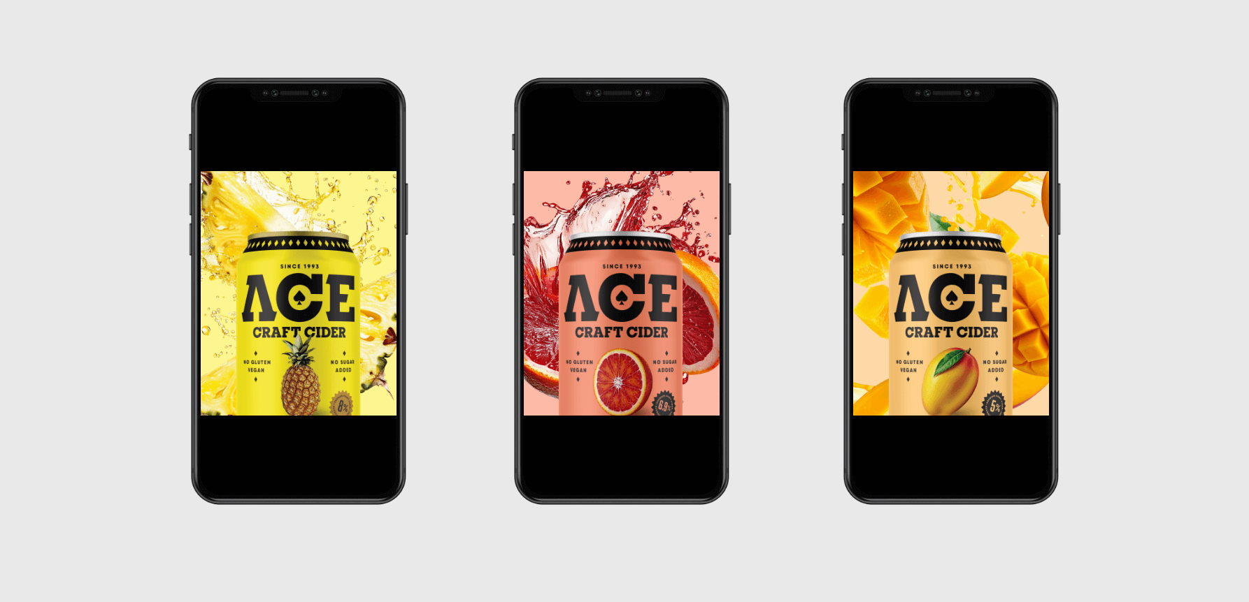
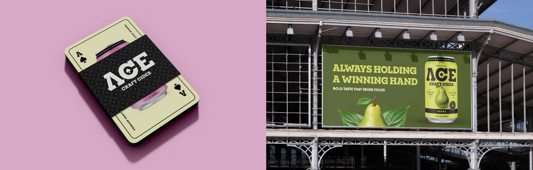
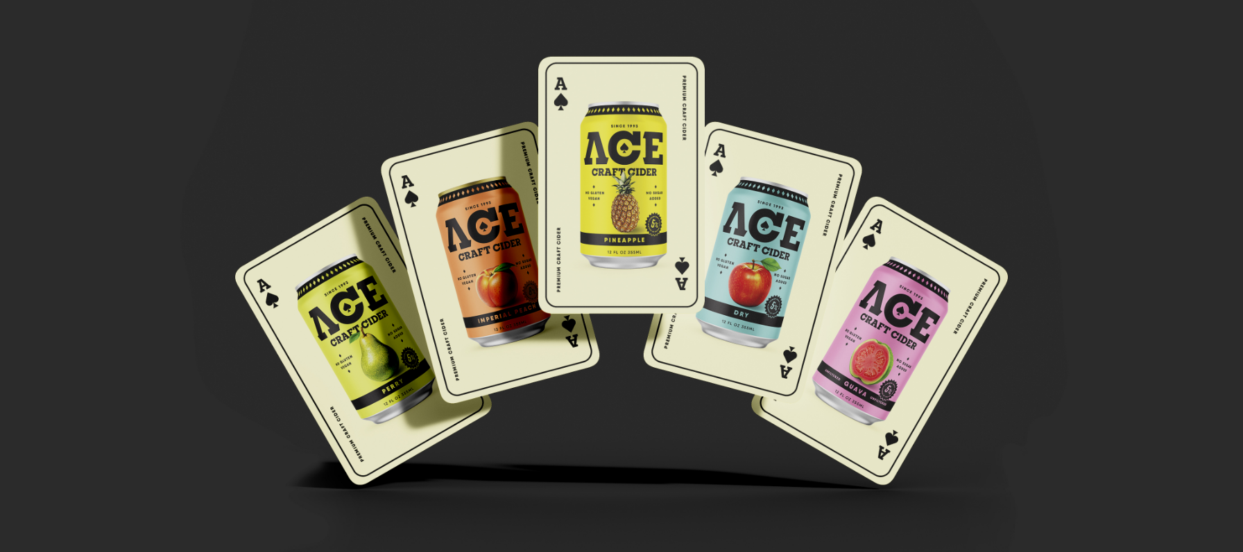
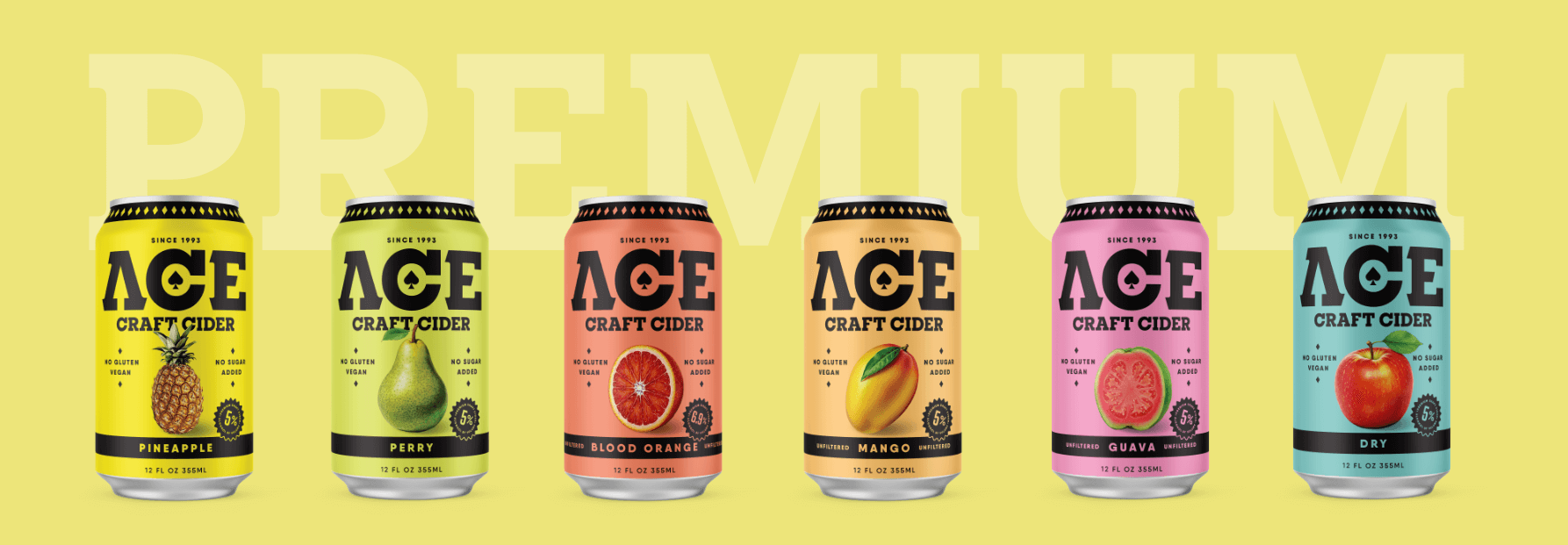
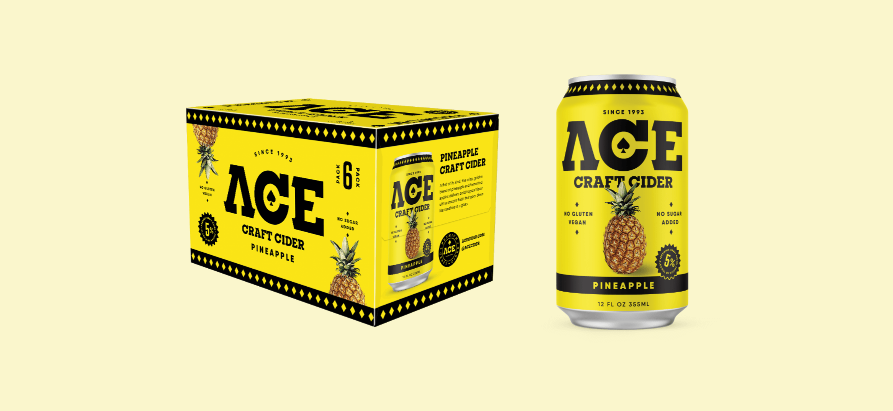
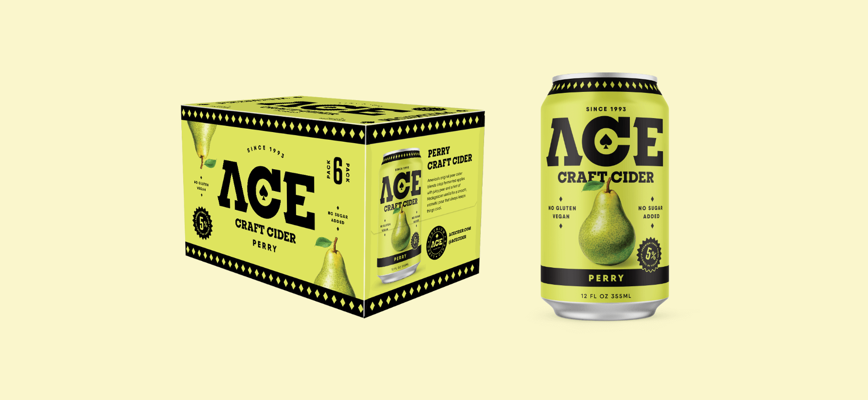
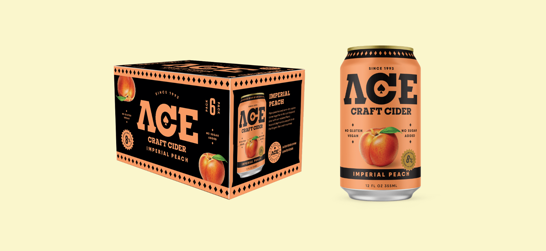
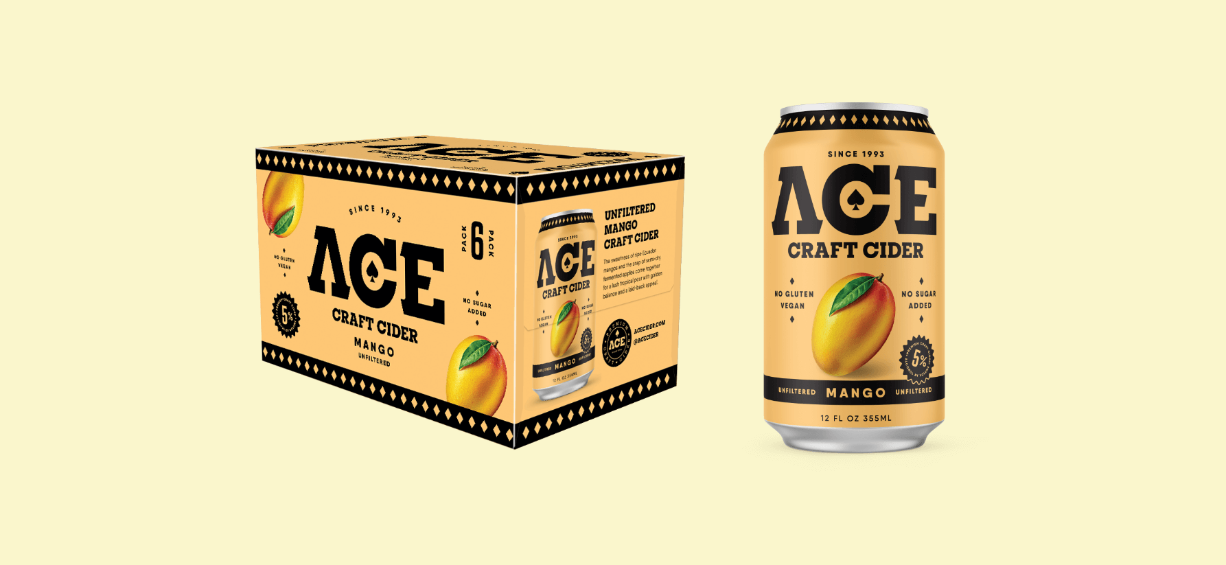
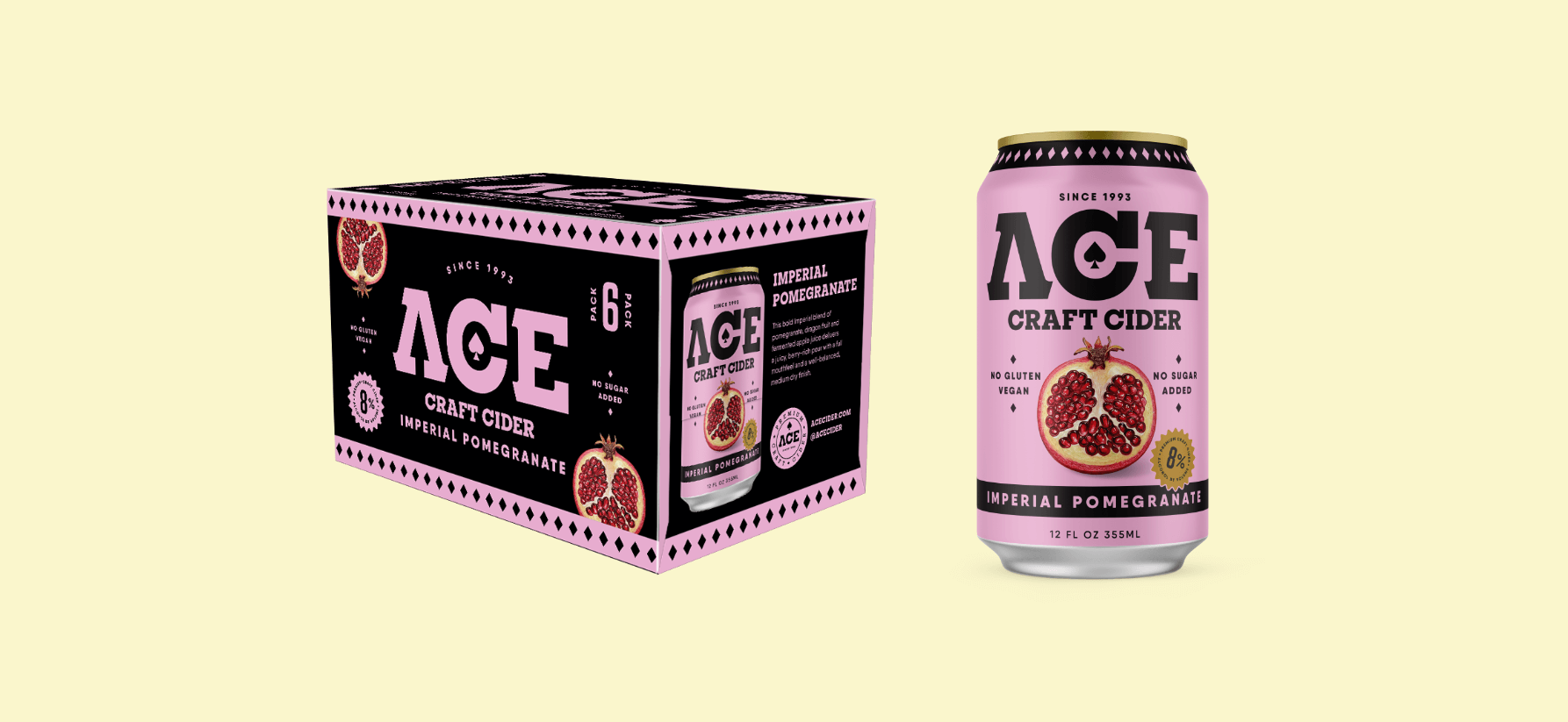
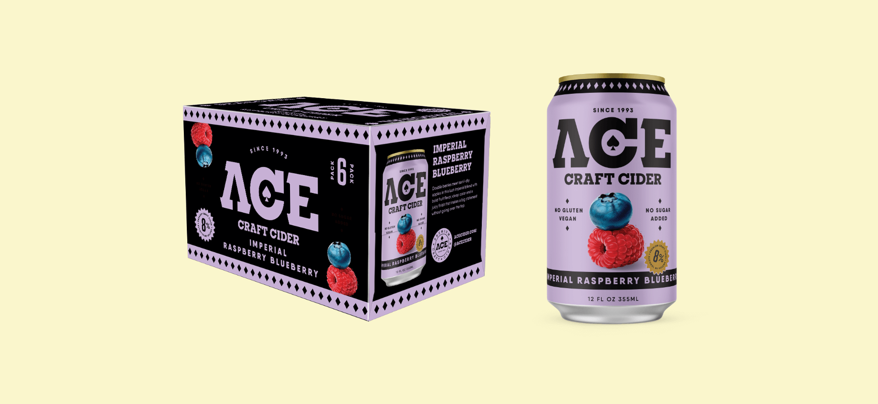
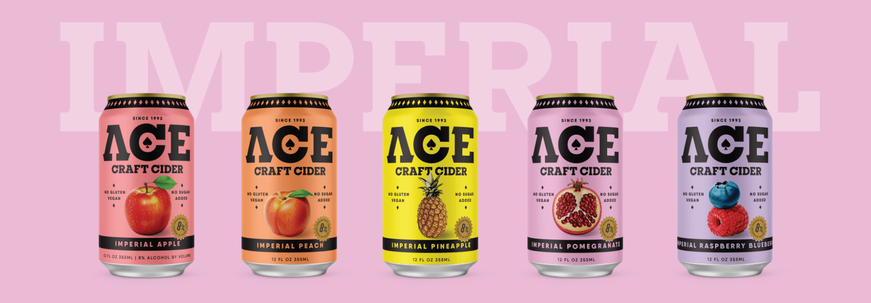
“Royally Crafted.” Our approach was to build a master brand system that put bold fruit and bold flavor at the very center of ACE’s identity. We created striking fruit illustrations to anchor each SKU, ensuring there was no question about what the consumer was getting. A clean, confident wordmark that maintained a resemblance to the original branding, along with disciplined packaging architecture, unified the entire portfolio across sessionable, imperial and alcohol-removed lines.
Each flavor was brought to life with a bright, unapologetic color system designed to mirror the fruit and make the lineup easier to shop. The balance of craft cues with approachable, modern design gave the brand an identity with mass appeal that feels elevated but never pretentious. In the end, we delivered packaging that is both timeless and contemporary — rooted in ACE’s pioneering California spirit while refreshing its presence for a new generation of cider drinkers.
The Good We Grew
The result was a cohesive packaging system that unified ACE’s three product tiers and gave the master brand a renewed sense of clarity and confidence. With bolder fruit cues and more intuitive flavor navigation, consumers can now instantly recognize what ACE offers at shelf, while the brand itself enjoys a stronger, more consistent presence across every format.
The new design not only reflects ACE’s 30-year history of quality and innovation, but also provides a flexible foundation to support future flavors, seasonal launches and category expansion. By refreshing its identity, we helped ACE cement its place as the cider originator and fruit-forward pioneer, ensuring that its legacy continues to grow in the decades to come.